
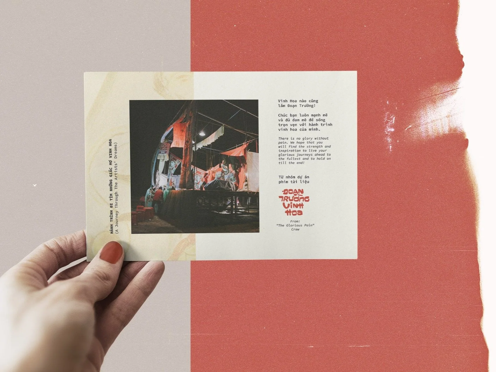
A journey through the artist’s dream.
Director: Lê Mỹ Cường
Art Director: Thanh Nguyễn
Graphic Designer: Thanh Nguyễn, Phạm Trang
Copywrite & Translate: Hương Giang, Alex
PR & Marketing: Mi Alpha
A Documentary Film by: Wetouch
Dự án này mở ra một chương mới trong hành trình sáng tạo của chúng tôi, khi lần đầu tiên khai phá vai trò thiết kế và truyền thông cho một bộ phim tài liệu điện ảnh, thử thách những giới hạn cũ và định hình những chuẩn mực mới.

About The Glorious Pain
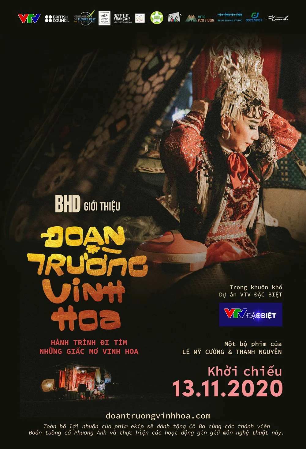
Đoạn Trường Vinh Hoa” hay tên Tiếng Anh là “The Glorious Pain” là một bộ phim tài liệu được xây dựng theo tinh thần hướng tới phong cách tài liệu điện ảnh trực tiếp được thực hiện trong hơn 18 tháng. Phim là hành trình theo chân một gánh cải lương tuồng cổ hiếm hoi còn sót lại rong ruổi qua những đình làng, cổ miếu ở các tỉnh miền Tây. Những ông hoàng bà chúa trên sân khấu nhưng cũng là những người lao động chật vật với đời sống mưu sinh khi bức màn sân khấu hạ xuống. Biến cố ập tới khi sóng gió xảy ra với những trụ cột của gánh hát. Tương lai nào cho gánh hát nhỏ của những con người miền Tây chất phác?
Official Trailer ↓
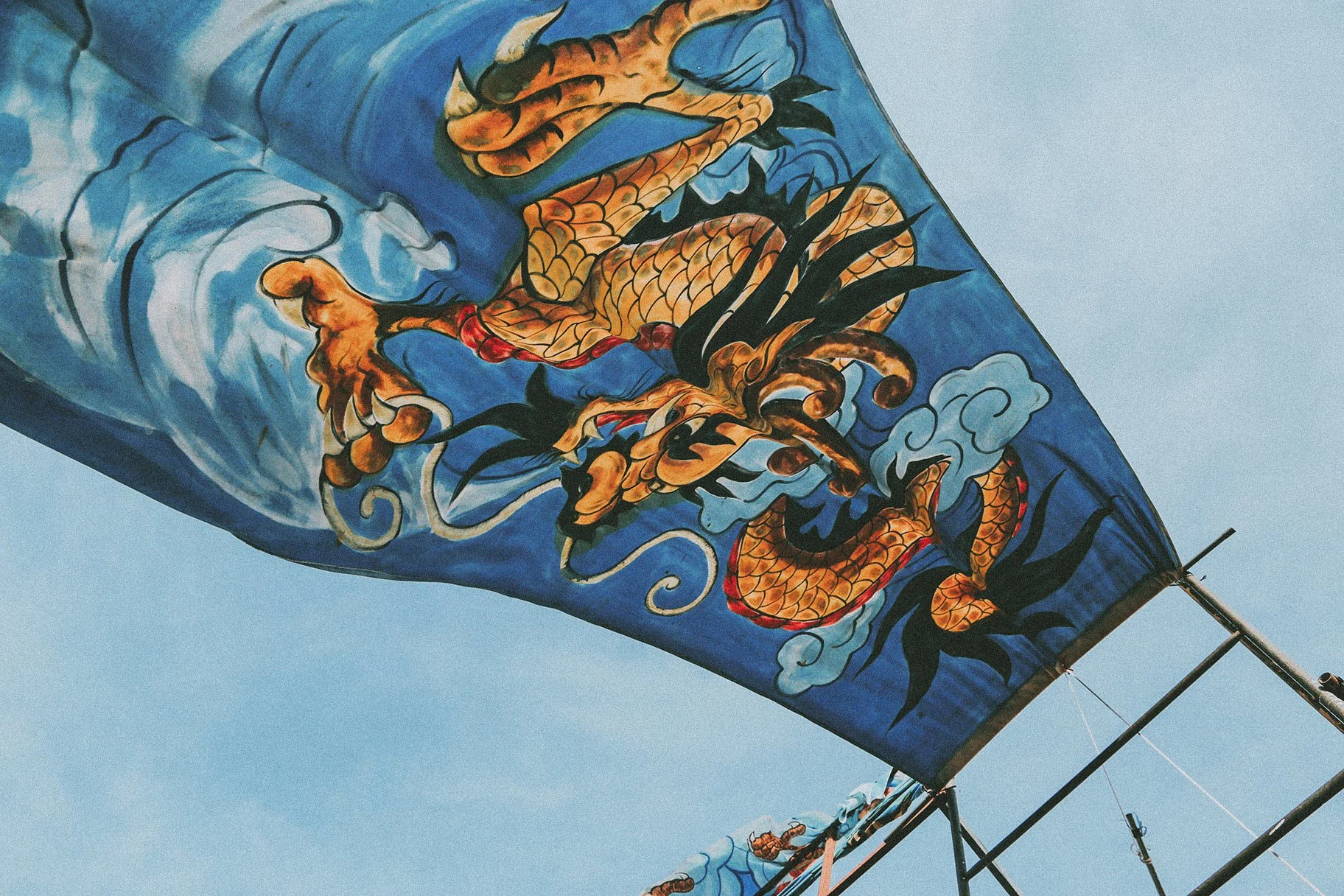
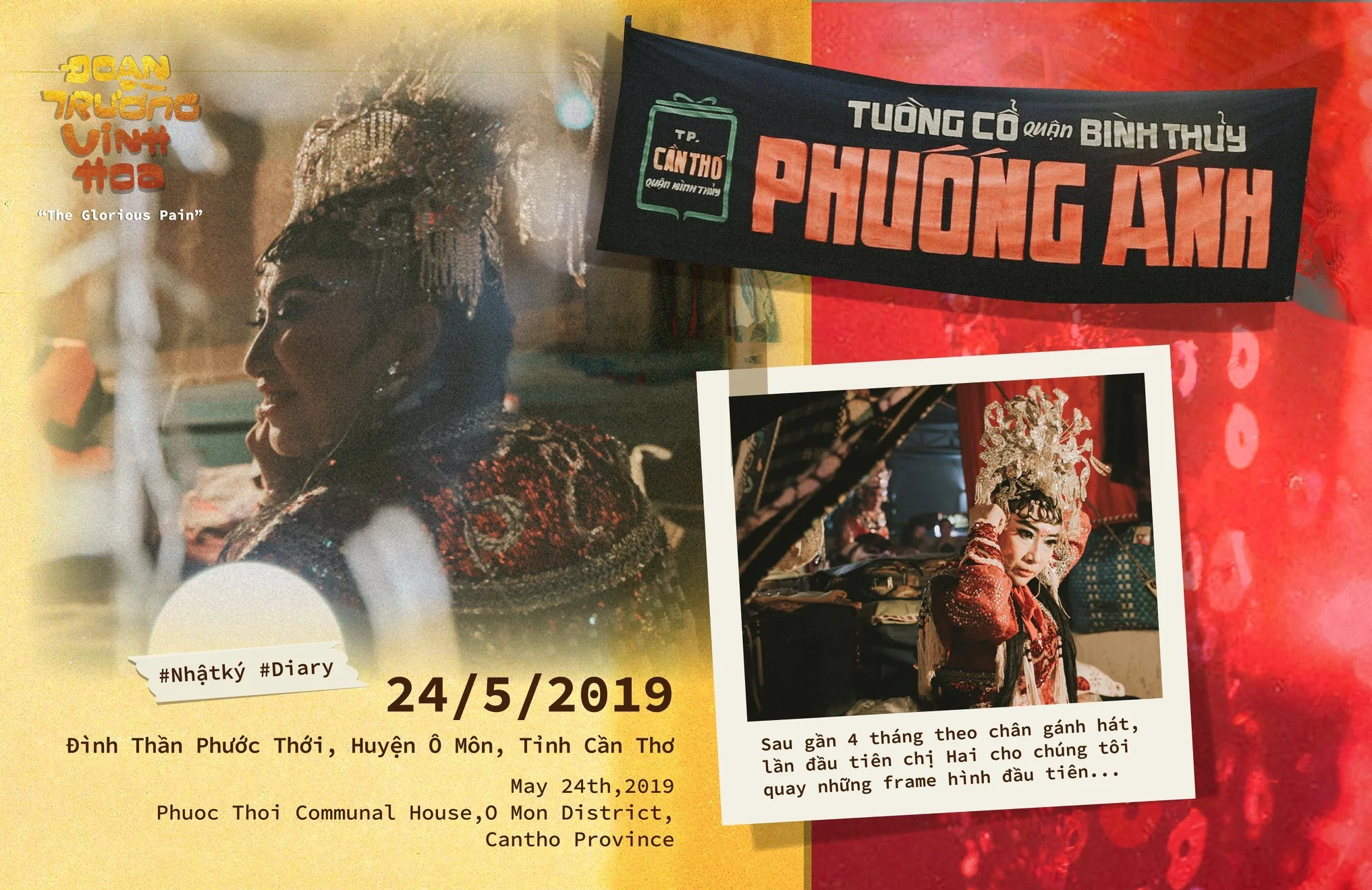
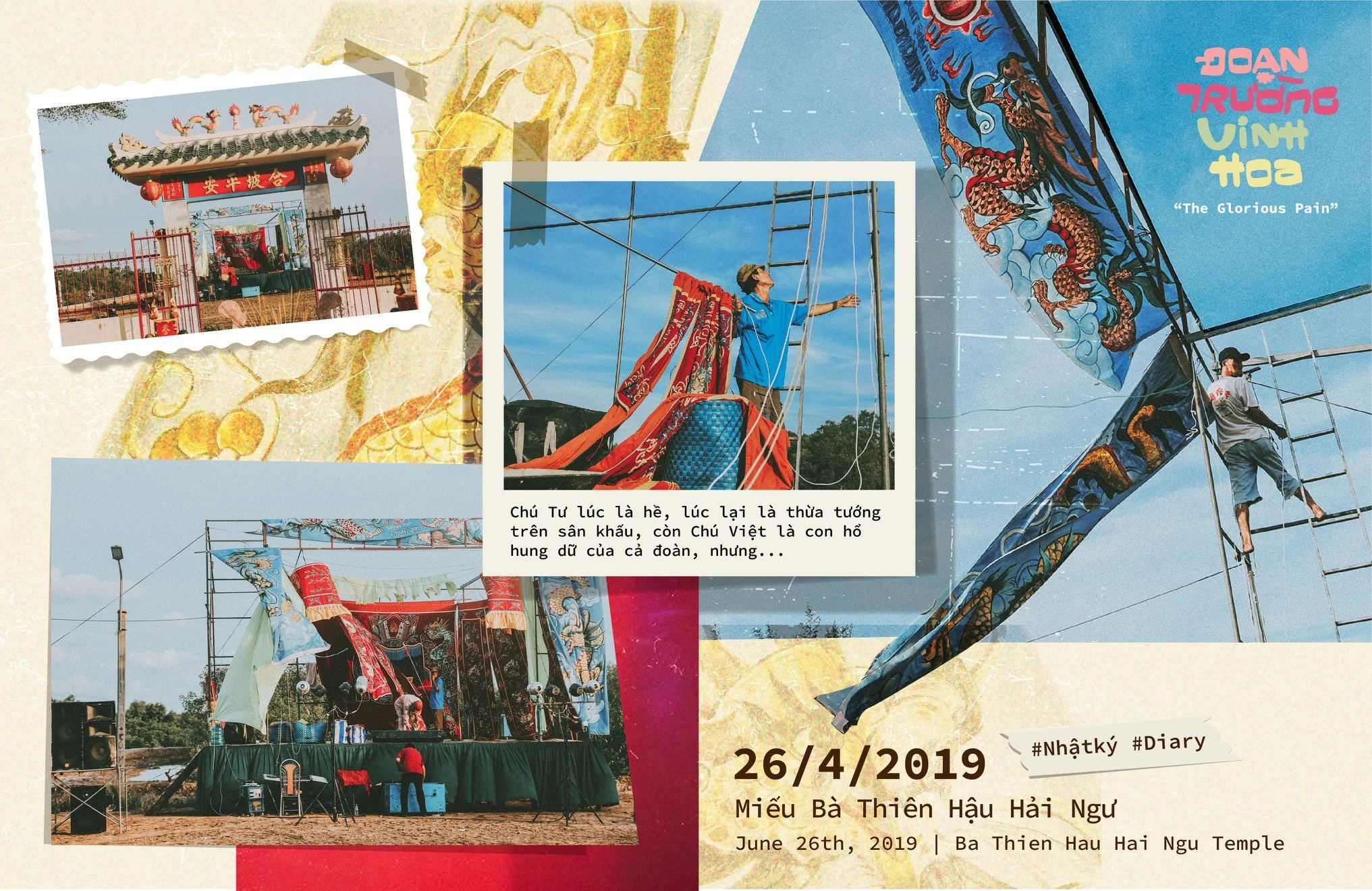
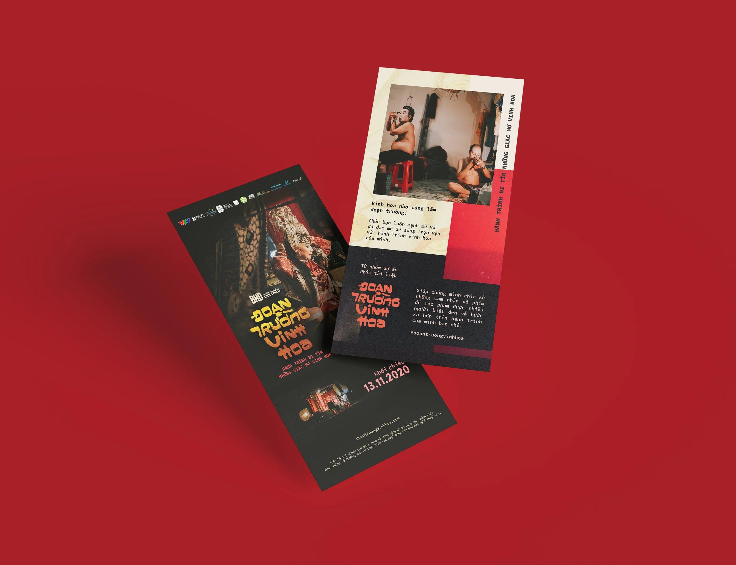
Một số hình ảnh mà chúng tôi ghi lại trong quá trình thực hiện dự án “Đoạn Trường Vinh Hoa”.


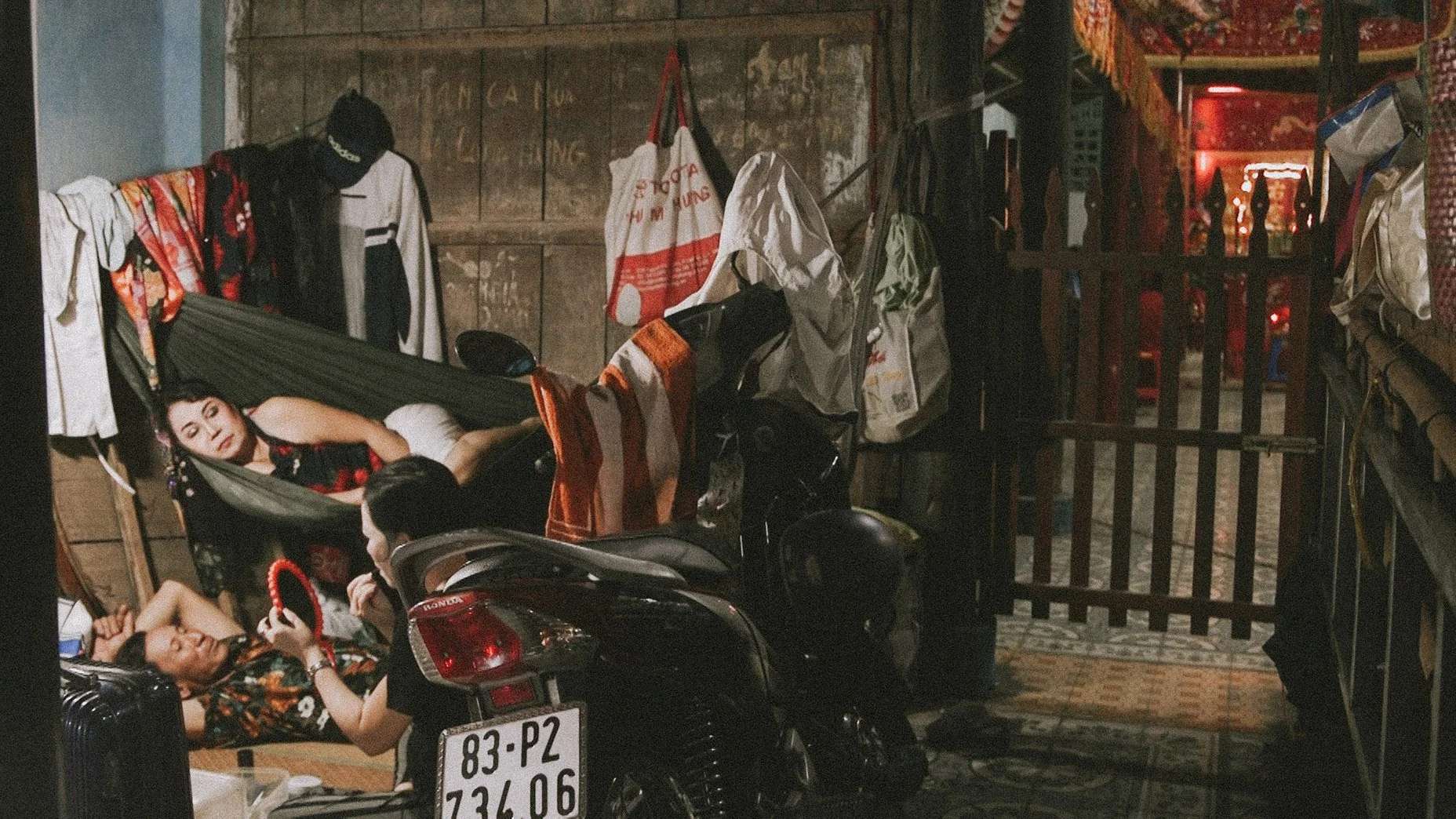


Bản thân tác phẩm đã chứa đựng trong nó nhiều chất liệu đời sống và nghệ thuật đặc trưng, bởi vậy, chúng tôi đã định hướng triển khai hình ảnh truyền thông cho Đoạn Trường Vinh Hoa từ chính những hình ảnh, chất liệu được tìm thấy trong quá trình thực hiện tác phẩm.
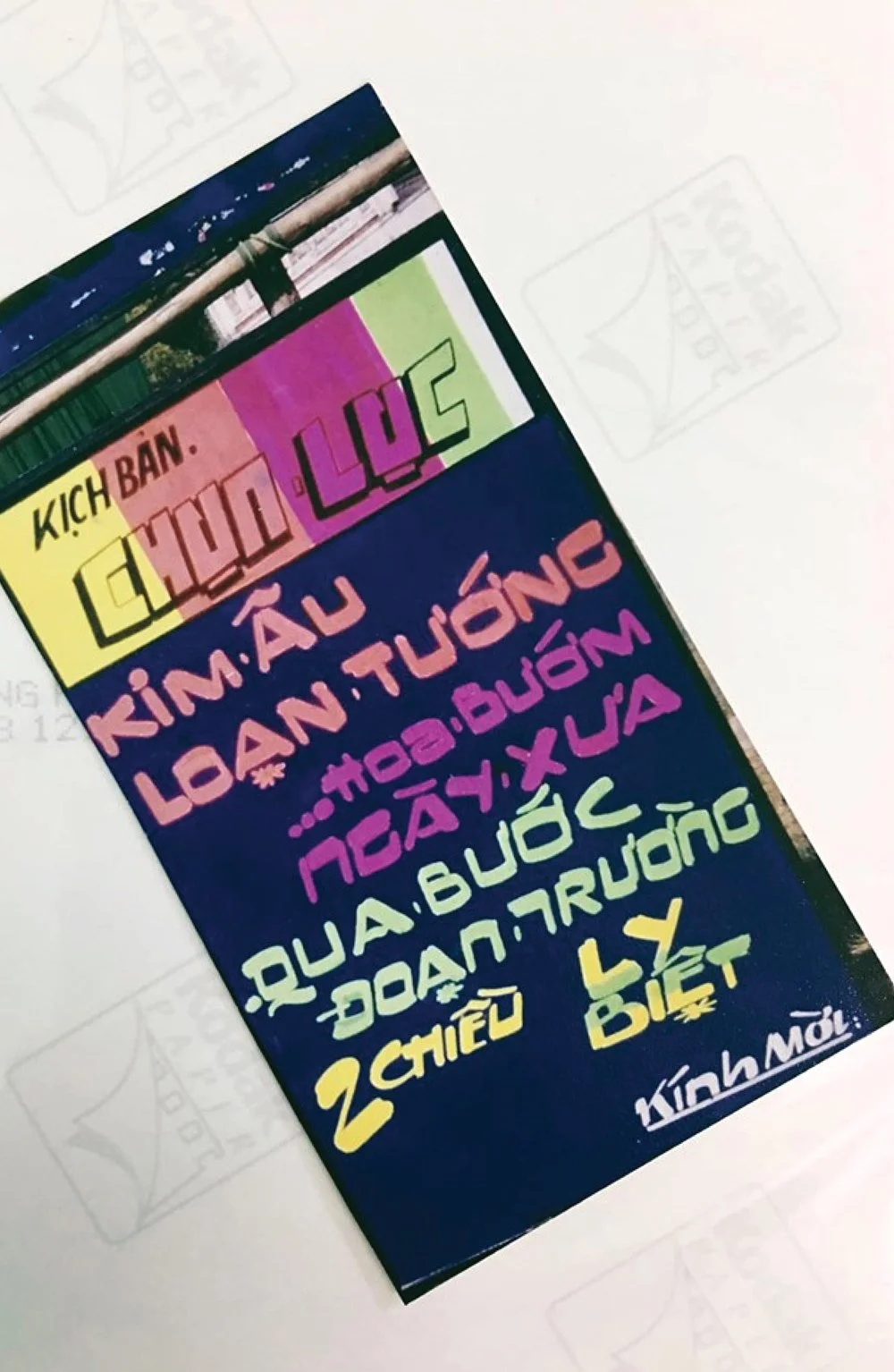
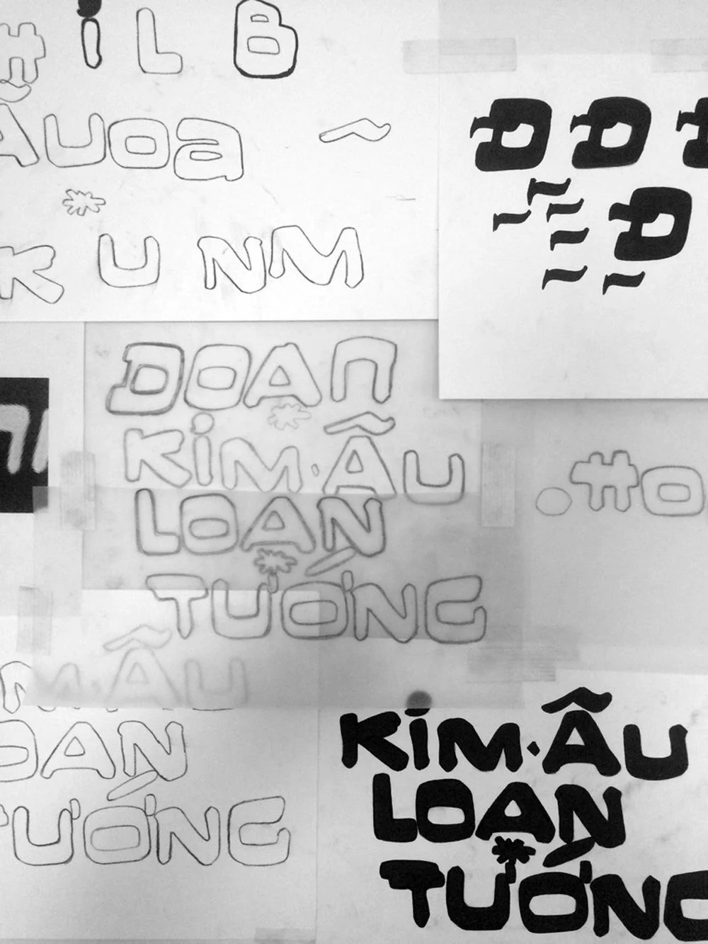
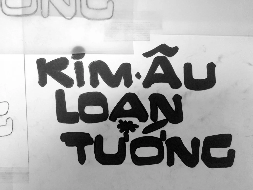
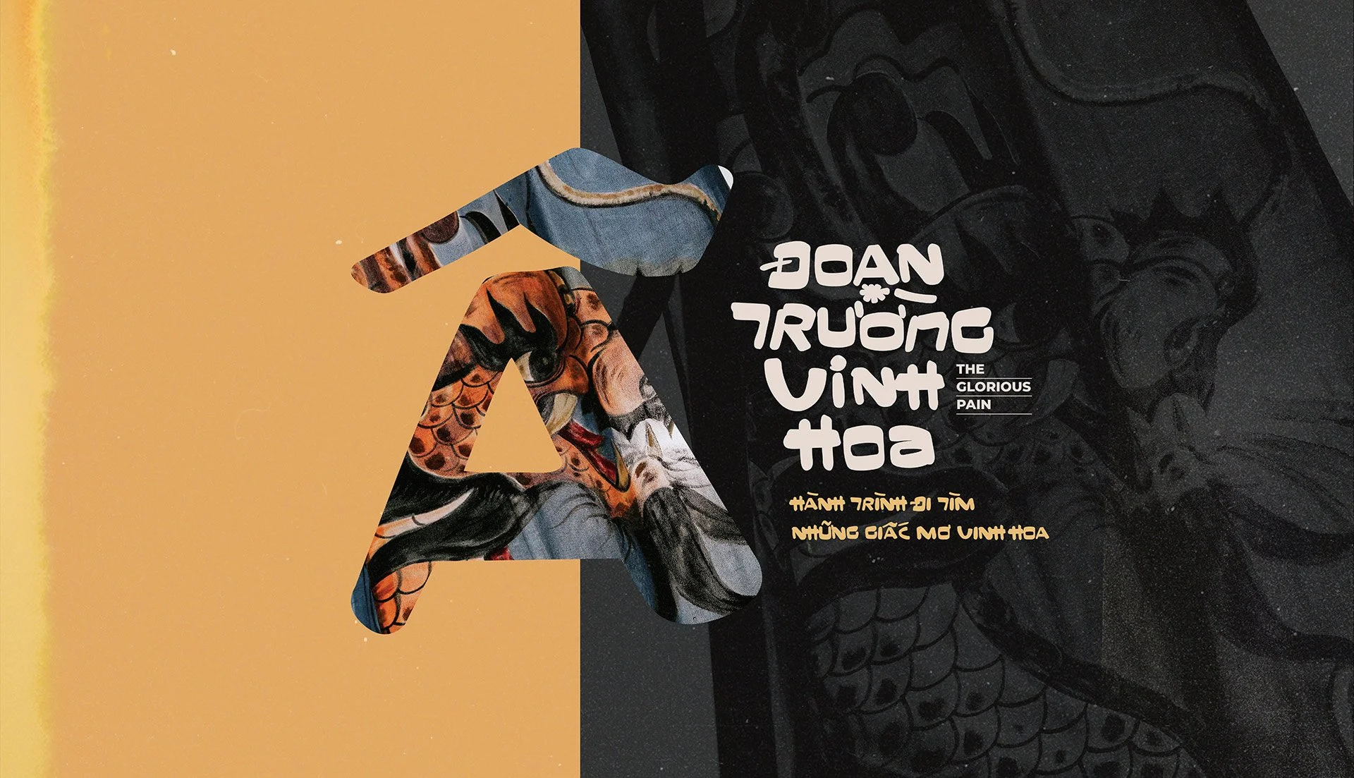
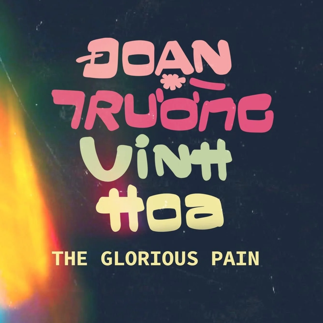
Thiết kế font chữ nhận diện và tên phim được xây dựng và phát triển dựa trên bức ảnh chụp một tấm phướn cũ mà gánh tuồng cổ Phương Ánh dùng để quảng bá cho các buổi diễn từ chục năm về trước. Điều mà chúng tôi cảm thấy ấn tượng là cho dù đường nét của các con chữ được vẽ thủ công và tô màu bằng tay, nhưng nó mang một tinh thần thần thời đại khó tả và bản thân tạo hình của những con chữ như đang kể câu chuyện về những vở tuồng.


The unique typeface.
Trong một lần tình cờ được cô Ba (Nghệ Sỹ Phương Ánh) cho xem những album ảnh được chụp từ những ngày xa xưa, chúng tôi chợt bị thu hút vào một bức ảnh chỉ toàn những con chữ được vẽ tỉ mỉ và thủ công với rực rỡ sắc màu của thời đại. Bất giác, chúng tôi nghĩ về một bộ chữ dành riêng cho tác phẩm của mình, lấy chất liệu từ những con chữ nhảy nhót ấy, từ chính những trải nghiệm của mình với nhân vật như vậy, nghĩ đã thấy hay ho. Thế rồi chúng tôi thực hiện, và font chữ Đoạn Trường Vinh Hoa ra đời.
Với nhóm dự án, cho dù những con chữ đơn giản này không tuân theo bất cứ quy luật, quy chuẩn nào, nhưng bản thân nó có câu chuyện riêng và có đời sống riêng quý giá, cũng giống như tất cả các nhân vật xuất hiện trong tác phẩm của chúng tôi vậy…
CLIP SHOWCASE QUÁ TRÌNH THỰC HIỆN BỘ CHỮ.


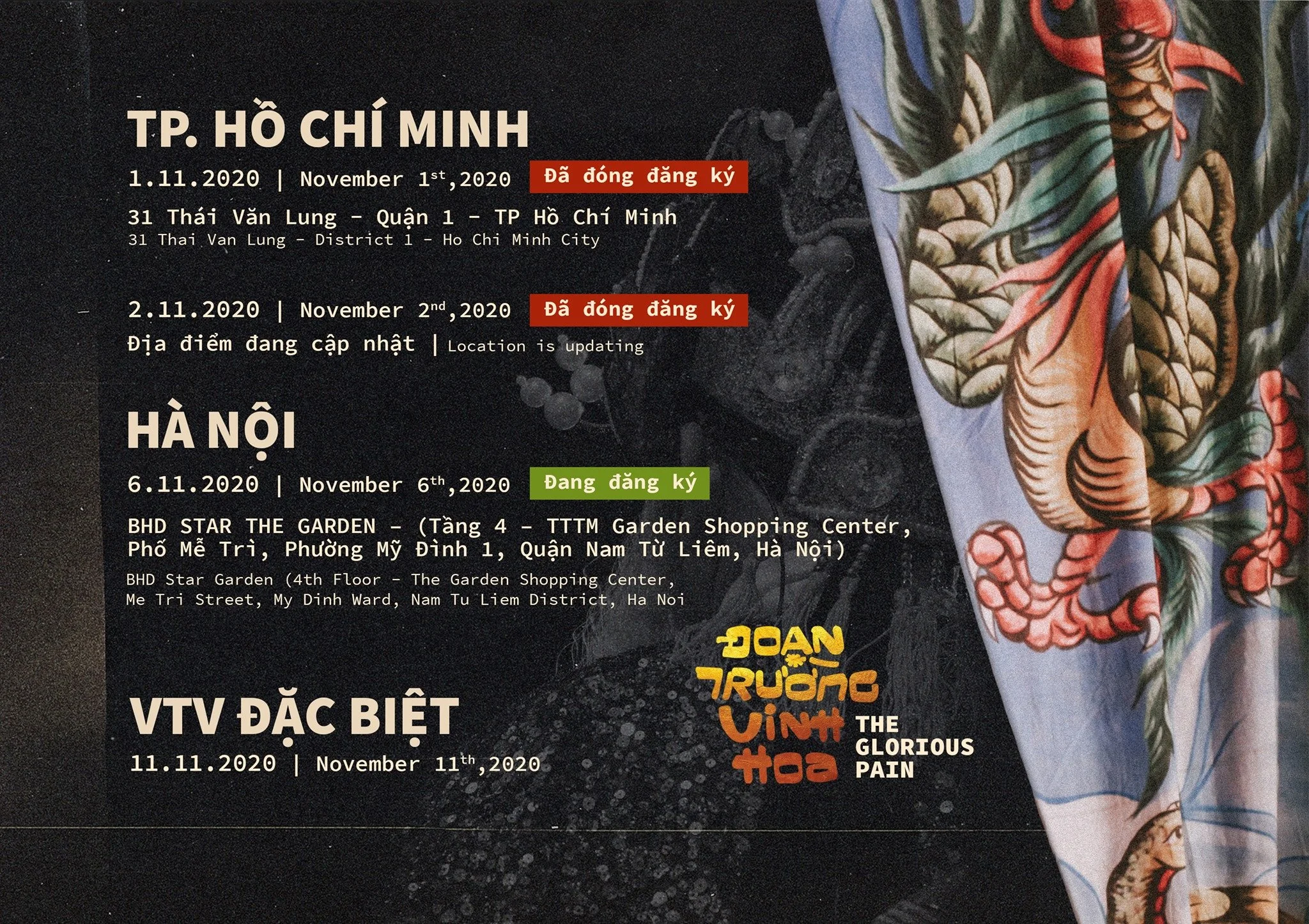
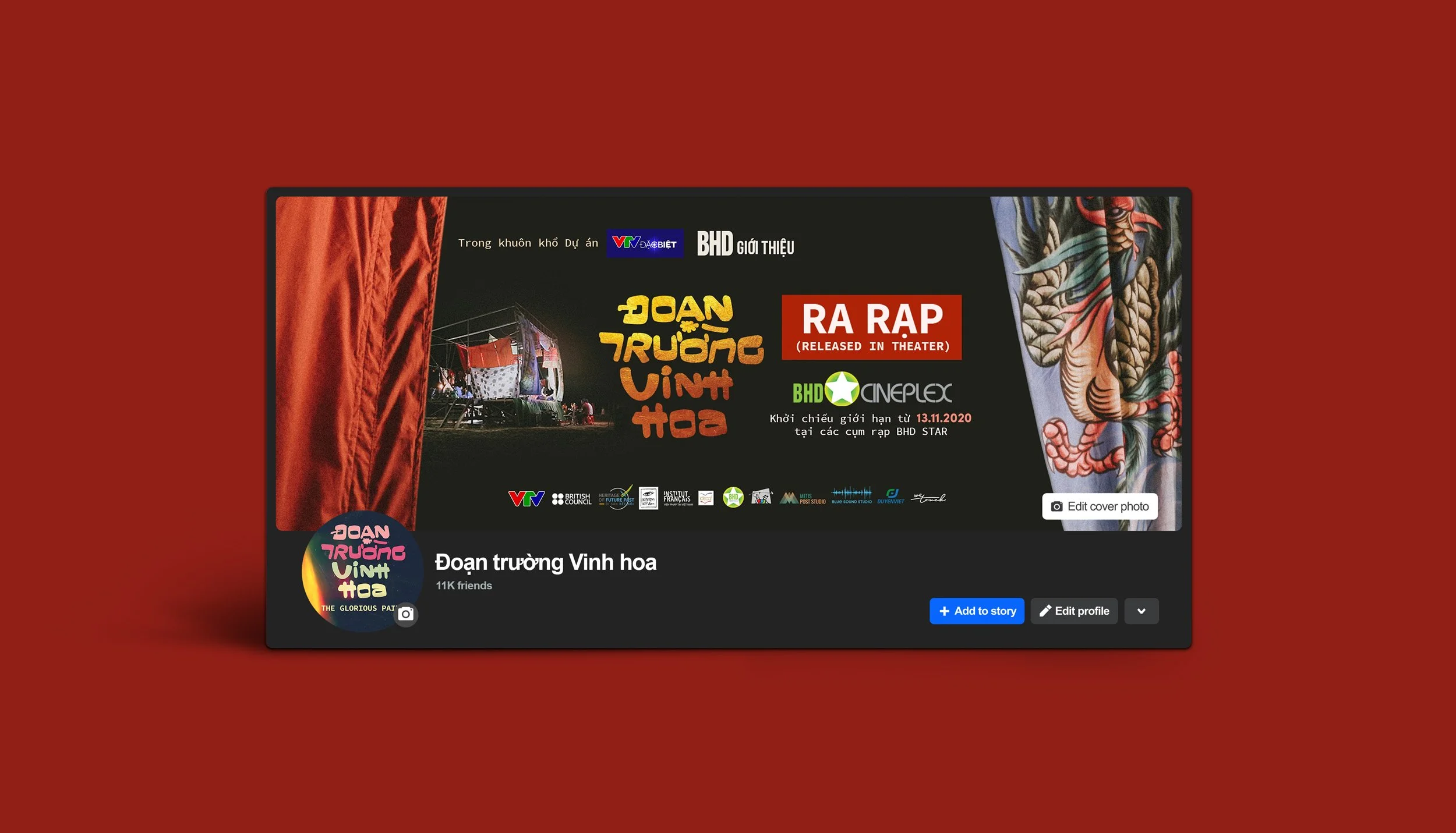
Sau đó, thiết kế tên phim và font chữ nhận diện được ứng dụng trên các sản phẩm truyền thông, xuất hiện trong bối cảnh của các buổi công chiếu, là yếu tố nhận diện xuyên suốt và đặc trưng, thú vị hơn nữa là nó dung hoà được cảm giác xưa cũ và hiện đại, mang màu sắc văn hoá và được các khán giả trẻ yêu mến.


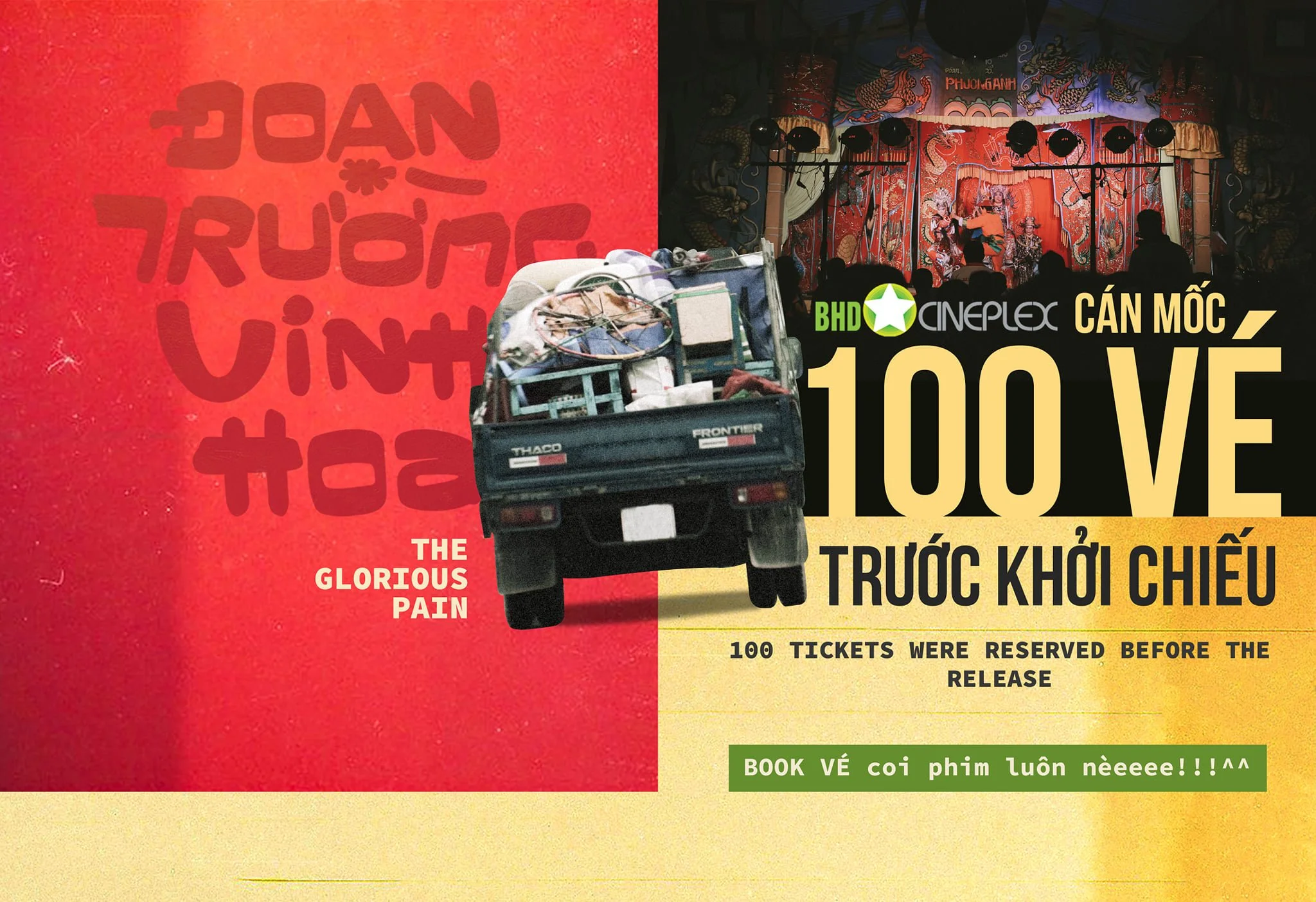
Bằng cách đơn giản hoá cấu trúc sản phẩm thiết kế để làm nổi bật chất liệu mà bản thân tác phẩm đang có, chúng tôi lựa chọn các hình ảnh tài liệu trong hàng ngàn bức ảnh mà chúng tôi đã chụp trong quá trình đồng hành cùng dự án để sử dụng trong các sản phẩm truyền thông.


Khi bức màn buông danh vọng hết,
Người về lòng rũ sạch sầu thương.
Người vào cởi áo lau son phấn
Trả cả vinh hoa lẫn đoạn trường.


với chúng tôi, "Đoạn Trường Vinh Hoa" không chỉ là hành trình kể lại câu chuyện của một gánh tuồng cổ hiếm hoi, mà còn là nỗ lực tái hiện vẻ đẹp của những giá trị nghệ thuật truyền thống trong bối cảnh hiện đại. Từ thiết kế nhận diện đến hình ảnh truyền thông, mỗi chi tiết đều được chăm chút để giữ nguyên bản sắc văn hoá, đồng thời mang đến một hơi thở mới, gần gũi hơn với khán giả trẻ. Đây không chỉ là một bộ phim tài liệu, mà còn là cây cầu nối giữa quá khứ và hiện tại, giữa những giá trị lâu đời và tinh thần sáng tạo đương đại.

Scope of product: DirectCinema
A Documentary Film by: Wetouch
Type: Graphic Design | Key Visual | Typeface Design
Designed and Photographed by: Wetouch
Director: Lê Mỹ Cường
Art Director: Thanh Nguyễn
Graphic Designer: Thanh Nguyễn, Phạm Trang
Copywrite & Translate: Hương Giang, Alex
PR & Marketing: Mi Alpha
A Documentary Film by: Wetouch
“We tell stories with every touchpoint”