
Shaping a Digital Brand for the Jewelry Industry.
Scope of product: Technology | Jewelry
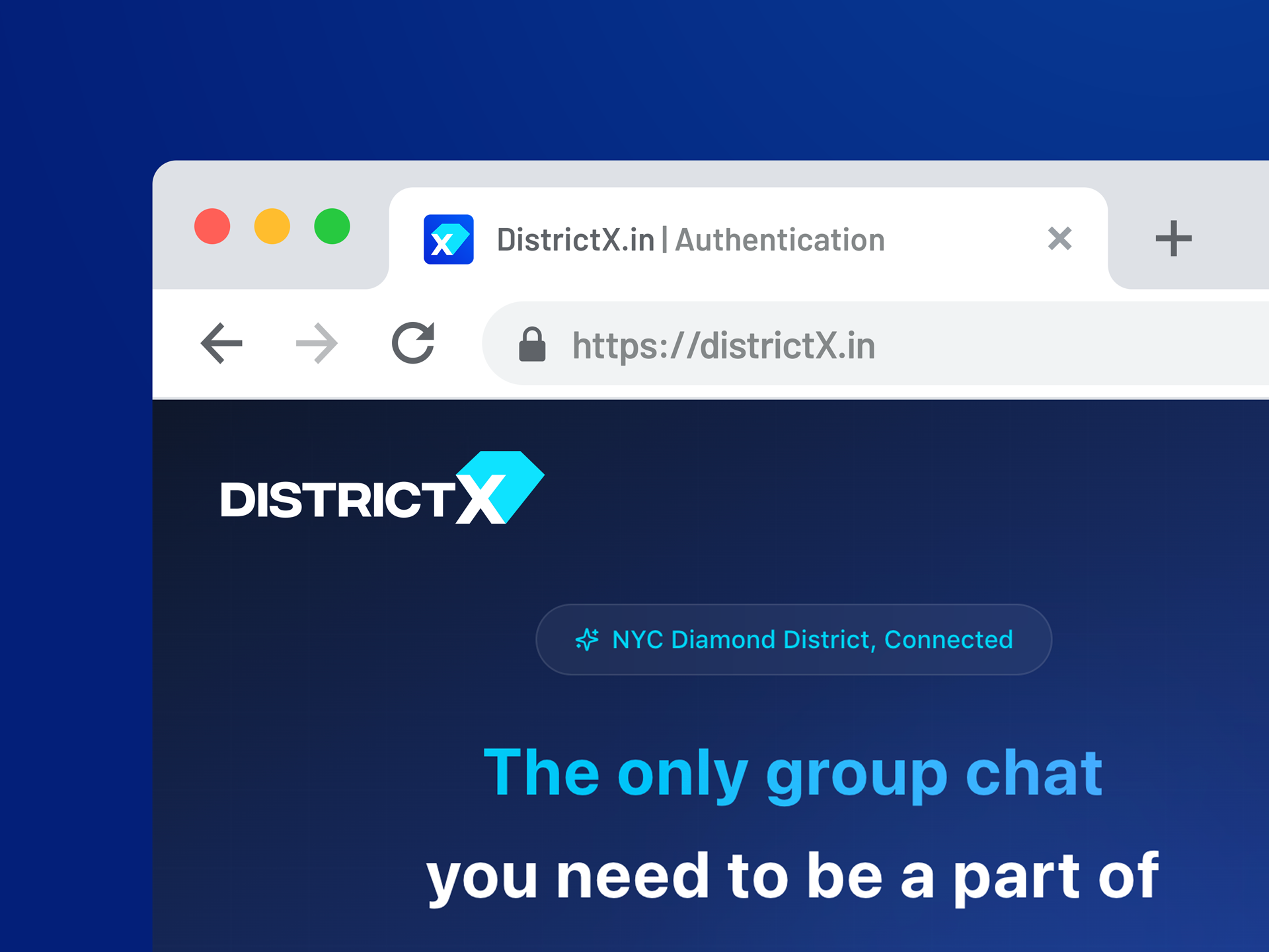
Client: DistrictX.in
Type:
Logo
Brand Key Visual
Brand Guideline
Visual Solution
Creative | Art Direction: Thanh Nguyễn
Graphic Design: BlueCy, Phương NT
Copywrite | Translate: Phương Thảo
“We tell stories with every touchpoint”
DistrictX là một nền tảng trực tuyến được xây dựng với mục tiêu kết nối các bên liên quan trong ngành kim hoàn - từ nhà cung cấp, thợ chế tác, cửa hàng bán lẻ cho đến các khách hàng cuối.
Dự án không chỉ dừng lại ở việc tạo ra một hệ thống nhận diện thương hiệu, mà hướng đến việc xây dựng một ngôn ngữ thị giác có khả năng đại diện cho một hệ sinh thái số - nơi các giao dịch giá trị cao, các mối quan hệ nghề nghiệp và sự tin cậy được tái định nghĩa trong môi trường online.
Trong bối cảnh đó, thiết kế không chỉ đóng vai trò củng cố hình ảnh, mà trở thành một phần của trải nghiệm - giúp thương hiệu trở nên rõ ràng, đáng tin cậy và có khả năng phát triển lâu dài.


Market.
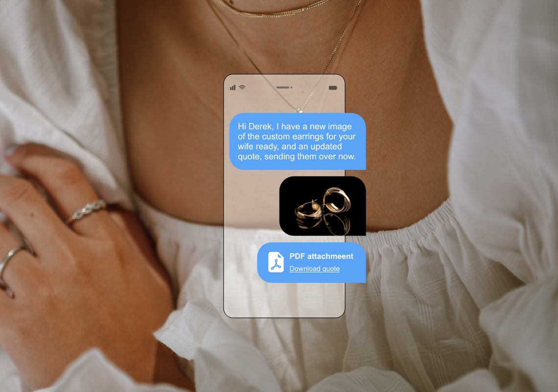
Ngành trang sức và kim hoàn là một lĩnh vực có giá trị giao dịch cao, giàu tính cá nhân và phụ thuộc mạnh vào uy tín. Tuy nhiên, trong thực tế, quá trình tìm kiếm nhà cung cấp, trao đổi với thợ chế tác, xác minh thông tin hay kết nối với khách hàng thường diễn ra một cách rời rạc thông qua các nền tảng như WhatsApp, Facebook, Discord…
Điều này dẫn đến: Thiếu tính minh bạch, khó kiểm chứng thông tin, phụ thuộc nhiều vào mối quan hệ cá nhân, rủi ro cao trong các giao dịch giá trị lớn. Chính sự phân mảnh này mở ra nhu cầu cho một nền tảng có khả năng chuẩn hoá kết nối và tái xây dựng niềm tin trong môi trường số.

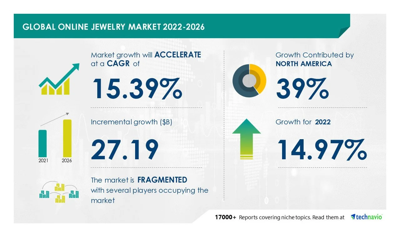
The global online jewelry market is experiencing rapid growth, with a projected CAGR of over 15% between 2022 and 2026. At the same time, the market remains highly fragmented, with multiple players operating across disconnected channels.
This combination of rapid expansion and structural fragmentation highlights a critical gap - the lack of a unified system that can support transparent, efficient, and trustworthy connections within the industry.

DistrictX khởi nguồn từ một nỗi trăn trở rất riêng của một người trong cuộc – một con người sống giữa nhịp thở hối hả của khu phố kim hoàn sầm uất nhất New York - phố 47, hay còn gọi là "The Diamond District".
Từ hàng ngàn cuộc trò chuyện trong những nhóm chat WhatsApp, Discord, Facebook rối rắm và thiếu kiểm chứng, đến những giao dịch bất an của khách hàng lẻ không biết bắt đầu từ đâu – DistrictX được hình thành như một lời giải đầy thấu cảm. Một nền tảng kết nối toàn bộ hệ sinh thái ngành trang sức toàn cầu, bắt đầu từ chính trái tim sôi động của ngành tại New York City.

Brand Story.
Nhưng làm thế nào để kể lại một câu chuyện công nghệ với tinh thần cao cấp, sang trọng và truyền thống như kim hoàn? Làm sao để biểu đạt một phần mềm hiện đại thông qua một logo có thể khơi gợi cảm xúc như các thương hiệu Cartier hay Rolex, nhưng vẫn hiện diện như Uber, Airbnb? Đó là nơi hành trình của Wetouch bắt đầu.
Strategic
Foundation
VAI TRÒ SẢN PHẨM
DistrictX là nền tảng số kết nối toàn bộ hệ sinh thái ngành trang sức - từ nguồn cung đến người tiêu dùng cuối.
MỤC TIÊU CHIẾN LƯỢC
Hỗ trợ quá trình chuyển đổi số của ngành kim hoàn bằng cách chuẩn hoá kết nối, tăng tính minh bạch và nâng cao hiệu quả giao dịch.
GIÁ TRỊ CẢM XÚC
Niềm tin là yếu tố cốt lõi.
Trong ngành trang sức, người dùng không chỉ mua sản phẩm - họ mua sự an tâm.
ĐỊNH VỊ THƯƠNG HIỆU
Một nền tảng công nghệ đáng tin cậy cho ngành kim hoàn: hiện đại như một sản phẩm số, tinh tế như một thương hiệu trang sức, và đủ uy tín để hỗ trợ các giao dịch giá trị cao.
→ Strategic Direction
Toàn bộ giải pháp thiết kế được xây dựng xoay quanh một định hướng cốt lõi: Từ niềm tin rời rạc đến hệ thống kết nối được xác thực.
DistrictX không chỉ đơn thuần là một nền tảng trung gian, mà là nơi các bên liên quan gặp nhau, thông tin được kiểm chứng và niềm tin được thiết kế thành một hệ thống. Điều này cũng trở thành trục giá trị xuyên suốt cho bộ nhận diện.


→Design Strategy
Hệ thống nhận diện được xây dựng dựa trên ba nguyên tắc chính;
TỐI GIẢN:
Thiết kế được tiết chế để đảm bảo khả năng nhận diện rõ ràng, dễ ghi nhớ và không phụ thuộc vào xu hướng ngắn hạn.
CÔNG NĂNG:
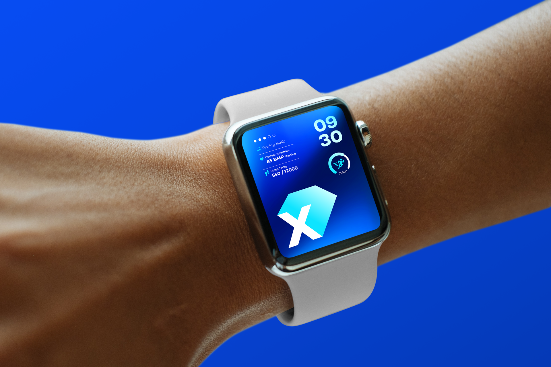
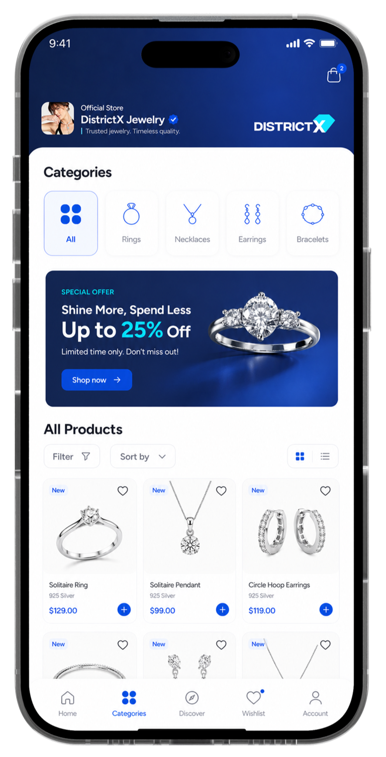
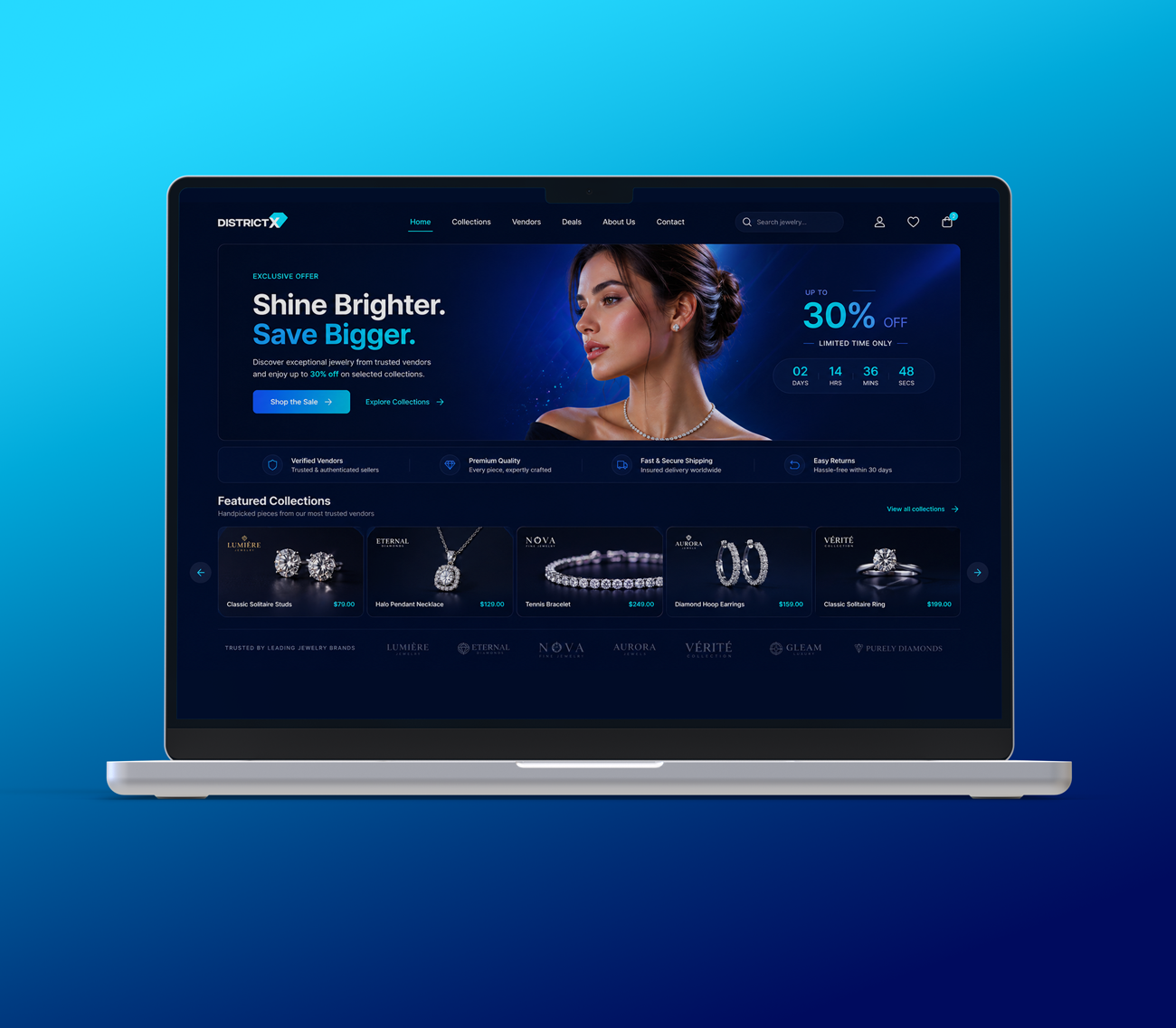
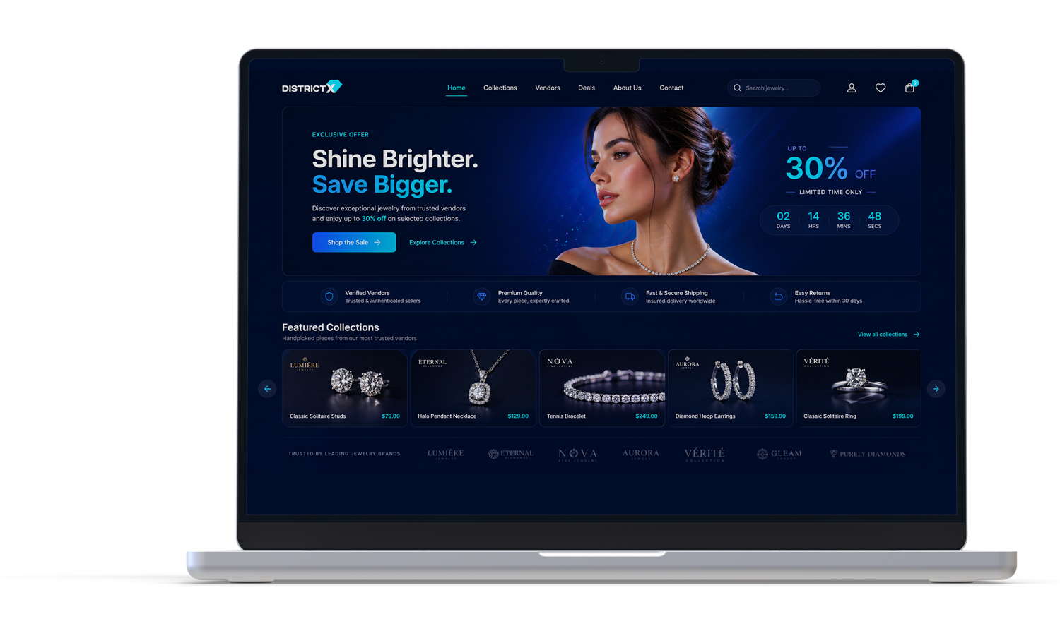
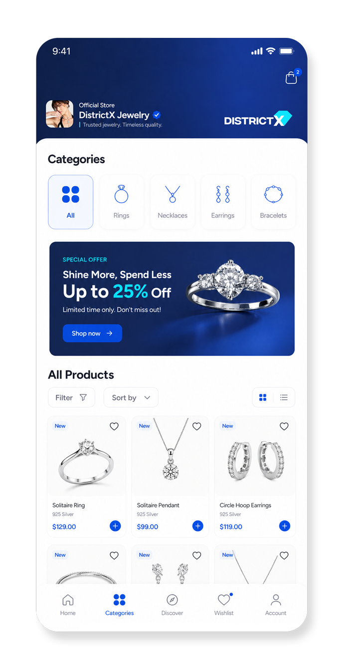
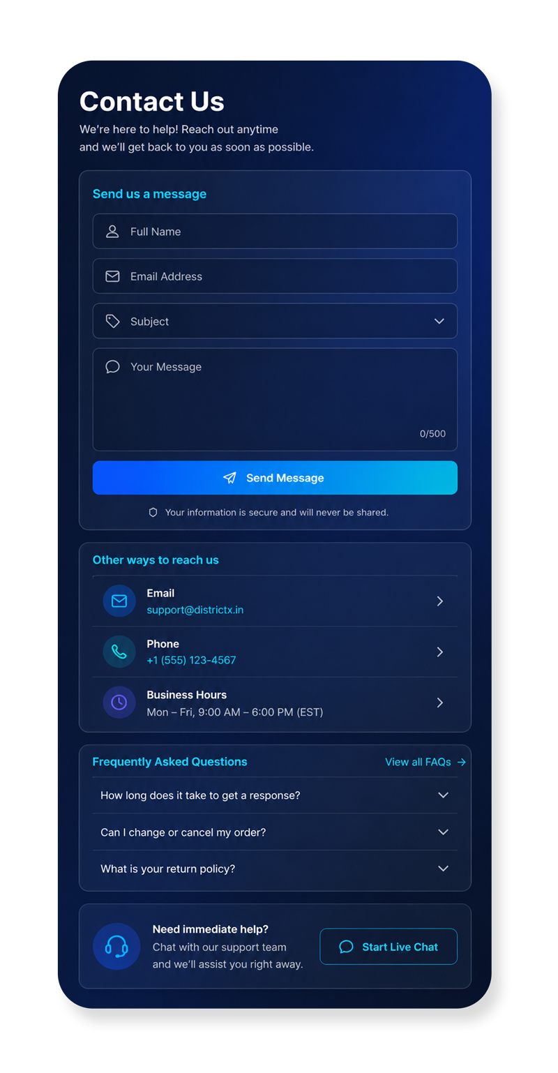
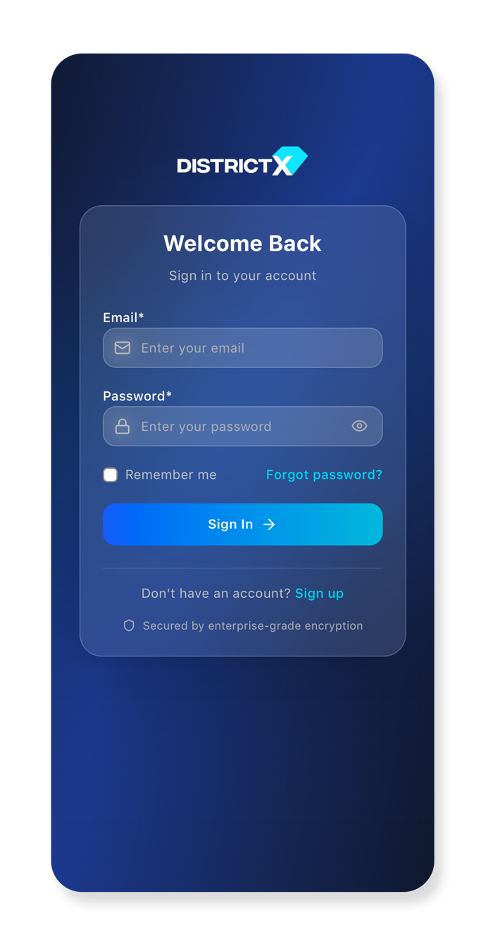
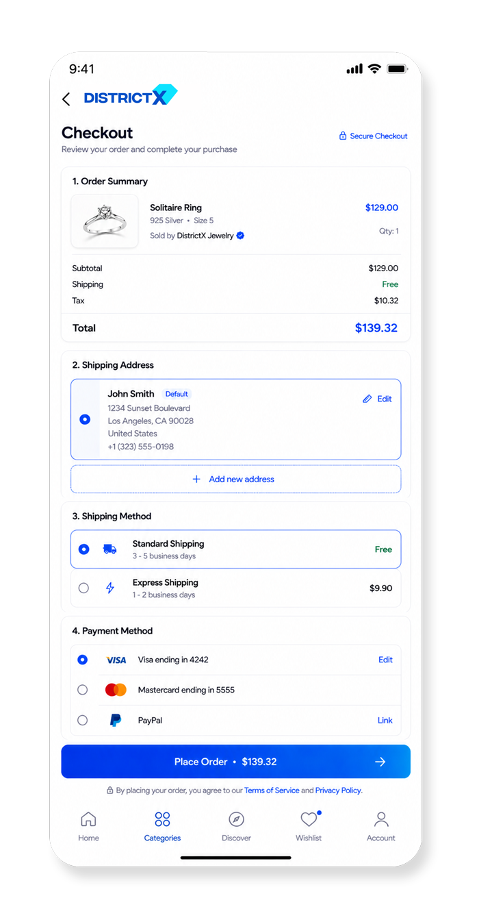
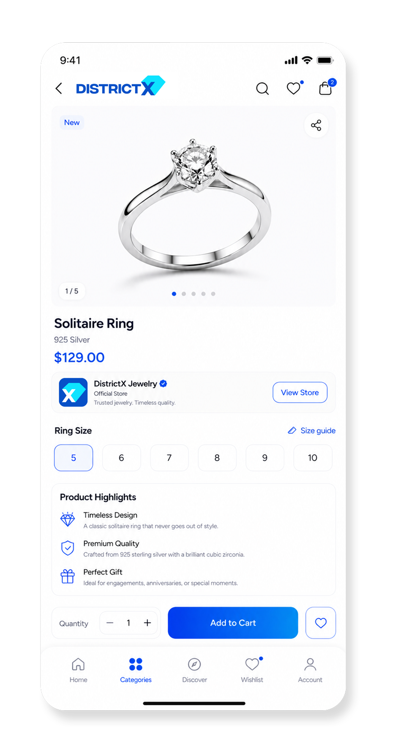
Logo và hệ thống hình ảnh phải hoạt động hiệu quả trong môi trường số: app, website, dashboard, social media,…
TÍNH BIỂU TƯỢNG:
Thiết kế cần giữ được liên kết với ngành kim hoàn thông qua những hình ảnh có ý nghĩa, đồng thời truyền tải vai trò kết nối của nền tảng.


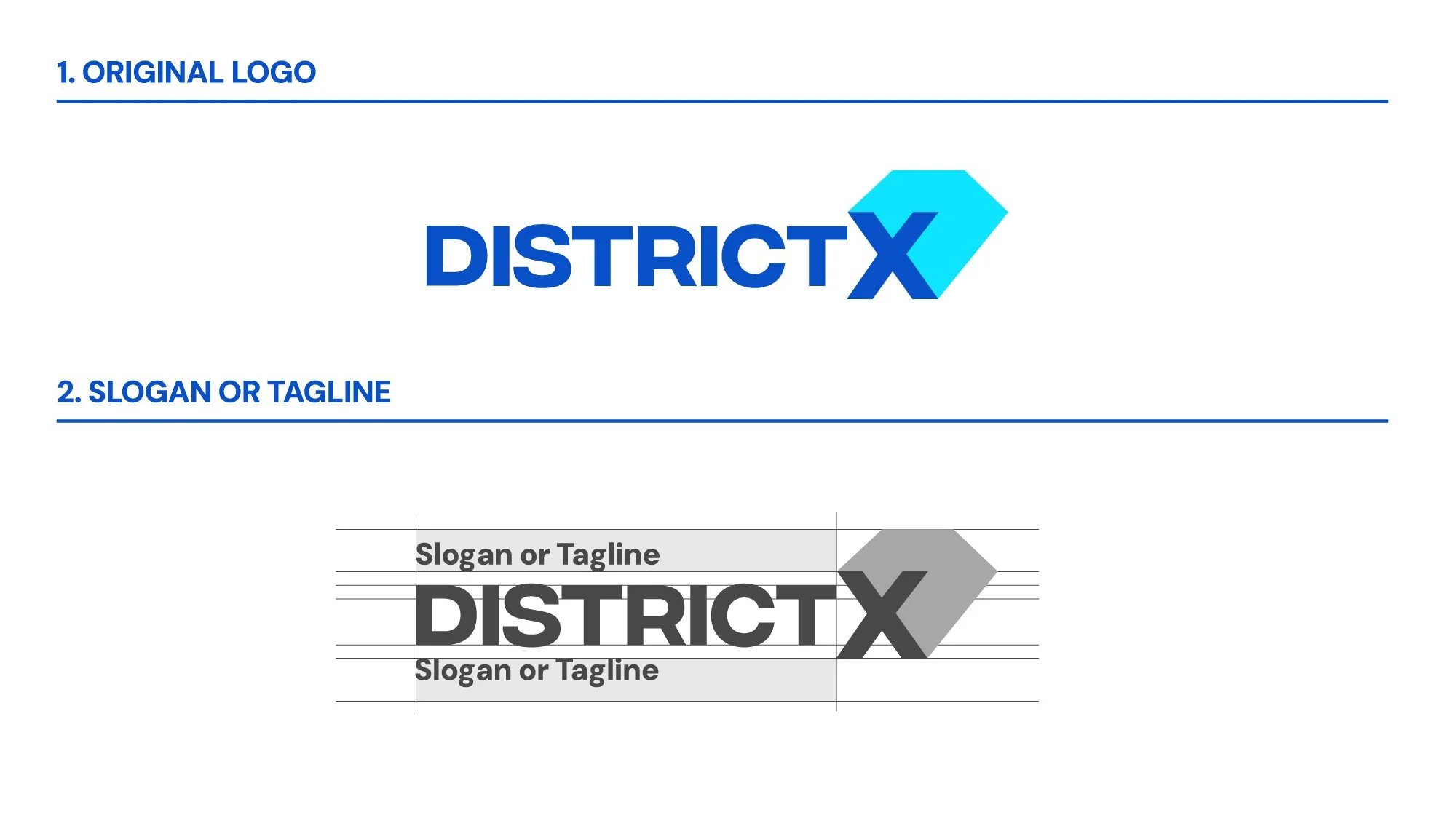
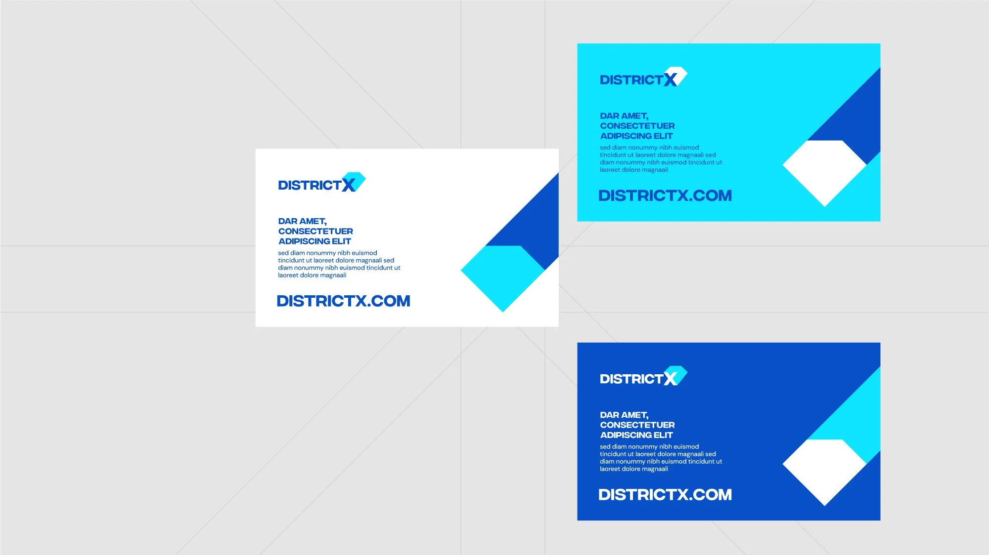
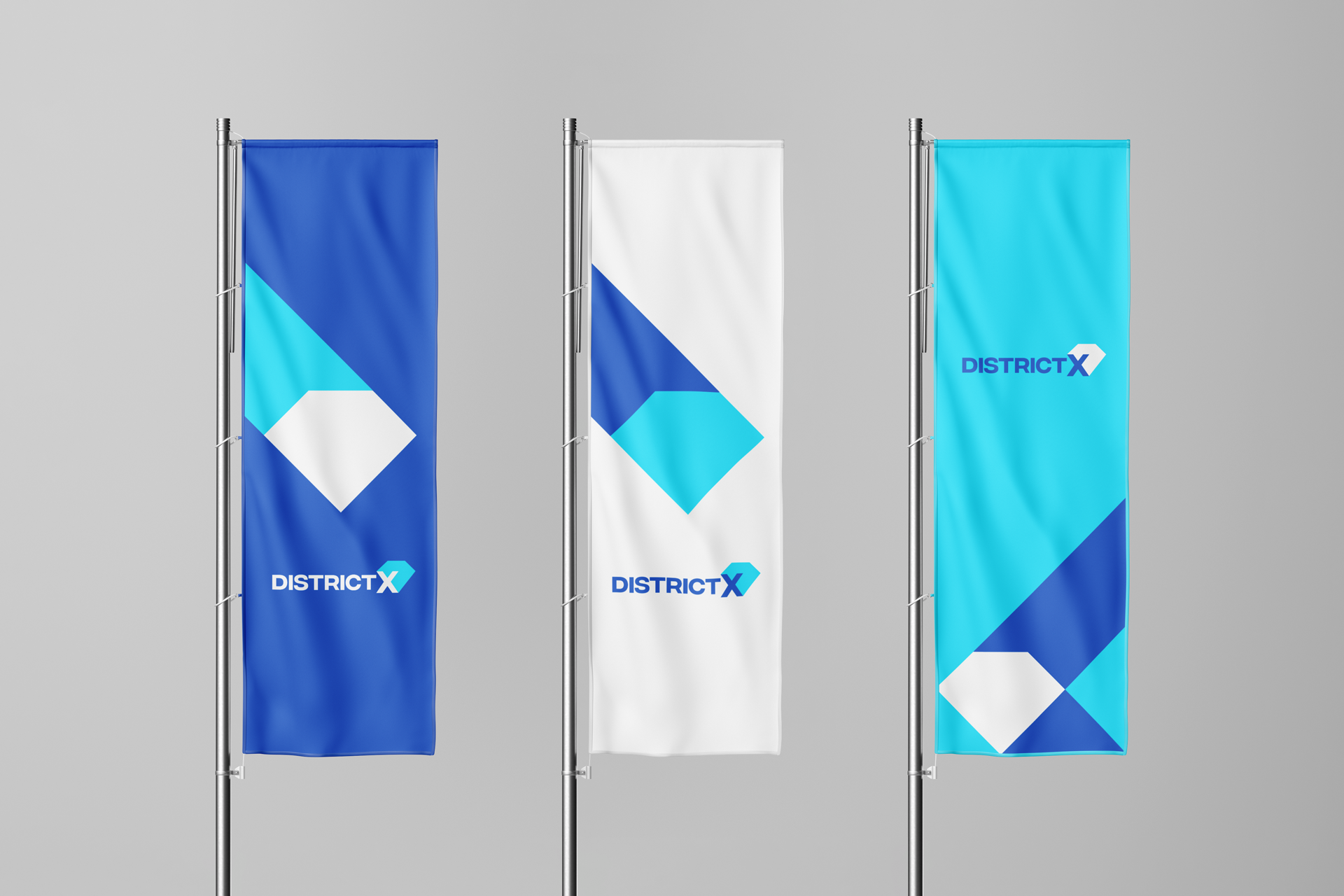
LOGO.
Logo DistrictX là sự kết hợp giữa hai yếu tố cốt lõi: Hình khối viên kim cương - đại diện cho ngành trang sức và Chữ “X” - biểu tượng của sự giao thoa, kết nối. Sự kết hợp này vừa tạo ra một biểu tượng nhận diện đặc trưng, vừa thể hiện vai trò của DistrictX - một điểm giao giữa các thành phần trong hệ sinh thái.
Biểu tượng kim cương - cũng là bóng của chữ X kéo dài về phía sau gợi cảm giác chuyển động, mang hàm ý về sự liên tục, bền vững, thể hiện cam kết của thương hiệu với giá trị lâu bền và tầm nhìn dài hạn, đồng thời vẫn duy trì được vẻ hiện đại và thanh lịch, phù hợp với khí chất của lĩnh vực này.


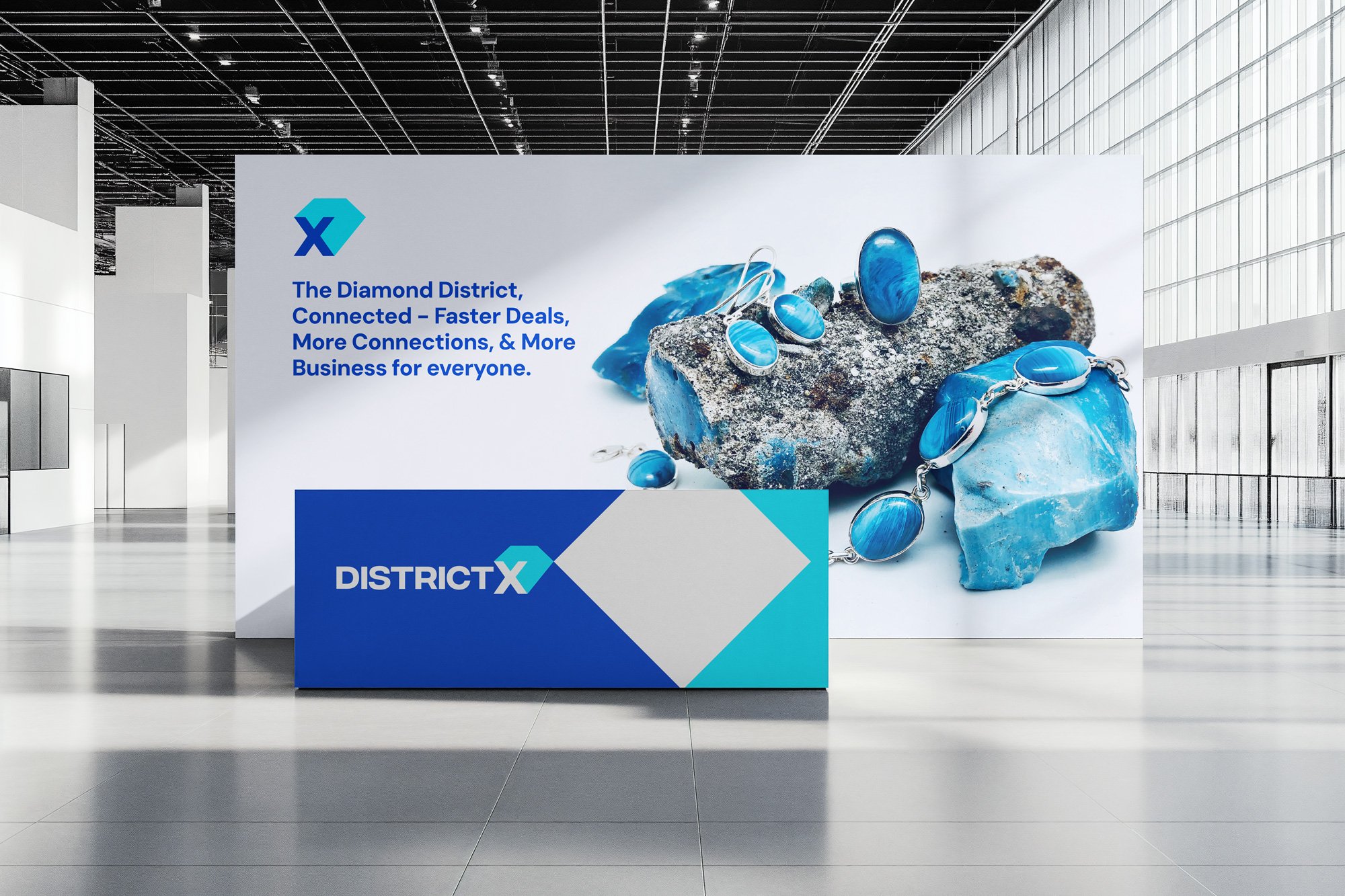
Key Visual -
Diamond Intersection.
Từ logo, hệ thống Key Visual được phát triển với ý tưởng “Diamond Intersection” - Viên kim cương nằm ở trung tâm, trong khi các đường giao cắt mở rộng ra xung quanh, tạo thành một mạng lưới liên kết. Ngôn ngữ này thể hiện sự kết nối đa bên, dòng chảy của thông tin và giao dịch, cùng vai trò trung tâm của nền tảng. Key Visual không chỉ mang tính trang trí, mà là cách thương hiệu diễn giải trực quan khái niệm “platform”.


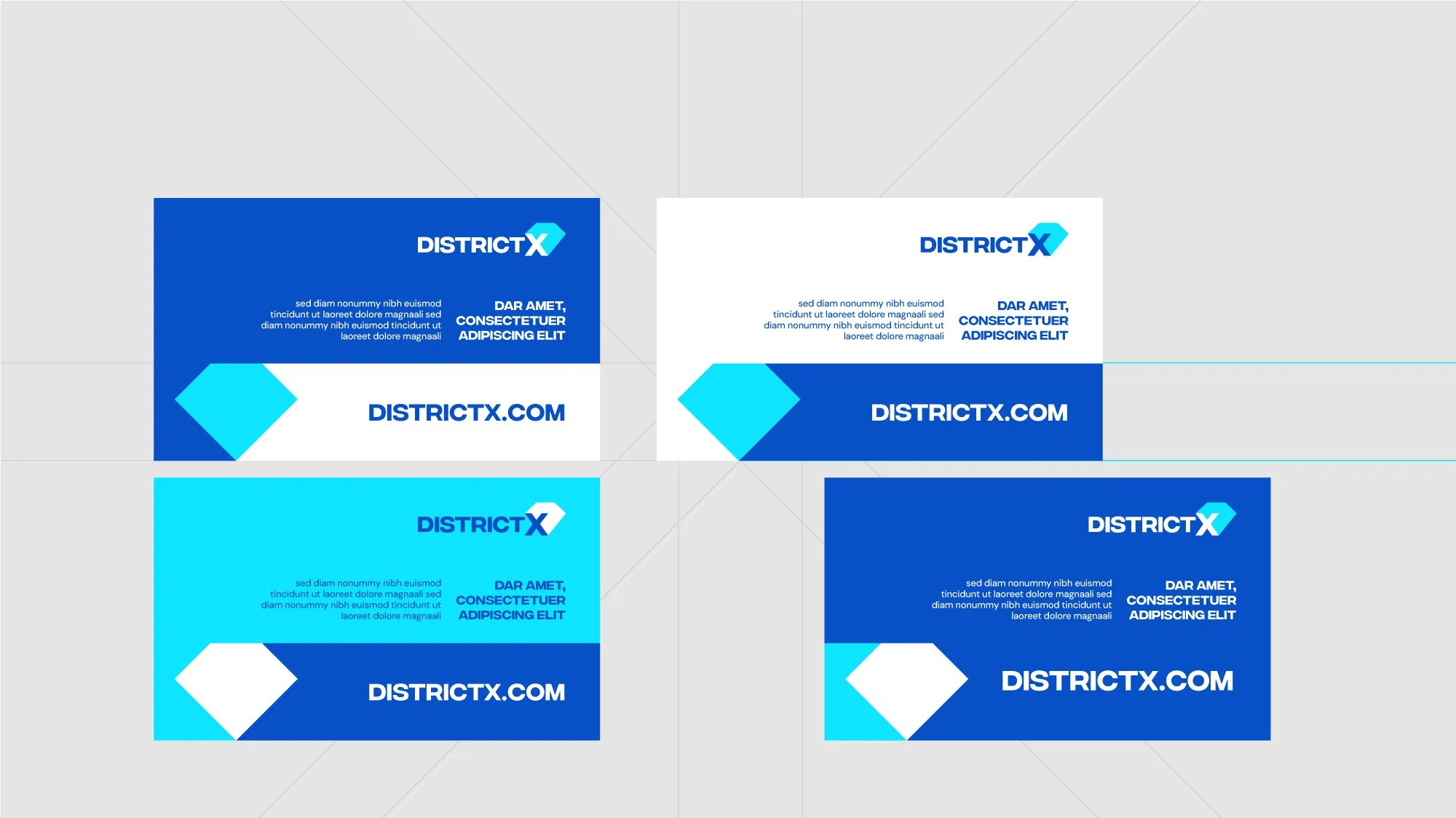


Key visual này cũng mở ra một hệ thống đồ hoạ linh hoạt (các nhánh, icon, grid, layout) - Giúp đồng bộ các thiết kế nền tảng (app, giao diện web, tài liệu giới thiệu...) - Tạo ra cảm giác động trong hệ sinh thái số - phù hợp cho motion graphic, video opening, và các hiệu ứng tương tác người dùng UI/UX.
DistrictX mang đến cho chúng tôi một nhận định rằng, khi một ngành nghề chuyển dịch sang môi trường số, vấn đề lớn nhất không nằm ở công nghệ, mà nằm ở việc tái thiết lập lại niềm tin - từ cách các bên kết nối, cách thông tin được tổ chức cho đến các thương hiệu xuất hiện và được nhận diện như thế nào.
Với chúng tôi, DistrictX là một nỗ lực của chúng tôi theo hướng đó. Dự án được phát triển như một hệ thống thị giác có khả năng phản ánh và hỗ trợ phương pháp mà nền tảng vận hành - nơi kết nối trở nên rõ ràng hơn, thông tin dễ kiểm chứng hơn và niềm tin được củng cố một cách nhất quán.
Cám ơn DistrictX đã cho chúng tôi cơ hội được đồng hành!
Scope of product: Technology | Jewelry
Client: DistrictX.in
Type: Logo | Brand Key Visual | Brand Guideline
Designed by: Wetouch
Creative | Art Direction: Thanh Nguyễn
Graphic Design: BlueCy, Phương NT
Copywrite | Translate: Phương Thảo
“We tell stories with every touchpoint”