
The essence in every grain of rice.
Scope of product: Organic Food
Client: Gao Mường
Type: Logo | Brand Identity | Packaging
Designed by: Wetouch
Creative Direction: LMC
Art Direction: Thanh Nguyễn
Outline Sketch: Lan Anh
Designer: BlueCy | Thanh Nguyễn | Hà Phương
“We tell stories with every touchpoint”
Một dự án thiết kế Logo, nhận diện và bao bì cho sản phẩm gạo lấy chất liệu từ văn hoá vùng miền Tây Bắc, với chúng tôi, GAO MƯỜNG là đại diện cho những thương hiệu nông nghiệp tại Việt Nam tìm cách ghi đậm dấu ấn của mình trong mắt người tiêu dùng bằng hình ảnh và nhận diện chuyên nghiệp.
BRAND ORIGINS.
“Lớn lên trên ruộng bậc thang miền Tây Bắc, được tưới tắm bằng nước tinh khiết từ khe núi, canh tác bằng kinh nghiệm làm nông thuần thủ công của đồng bào người Mông, người Dao, người Nùng…”
Đó là những gì khách hàng của chúng tôi chia sẻ về sản phẩm của họ. Bởi thế, khi đặt vấn đề với Wetouch, GAO MƯỜNG không chỉ kỳ vọng vào một hình ảnh nhận diện chuyên nghiệp và đồng bộ, mà hơn hết họ muốn đưa những đường nét văn hoá vùng miền và gợi nhớ về chất lượng sản phẩm, gợi nhớ về những gì tinh tuý nhất mà họ mong muốn dành tặng cho khách hàng của mình.

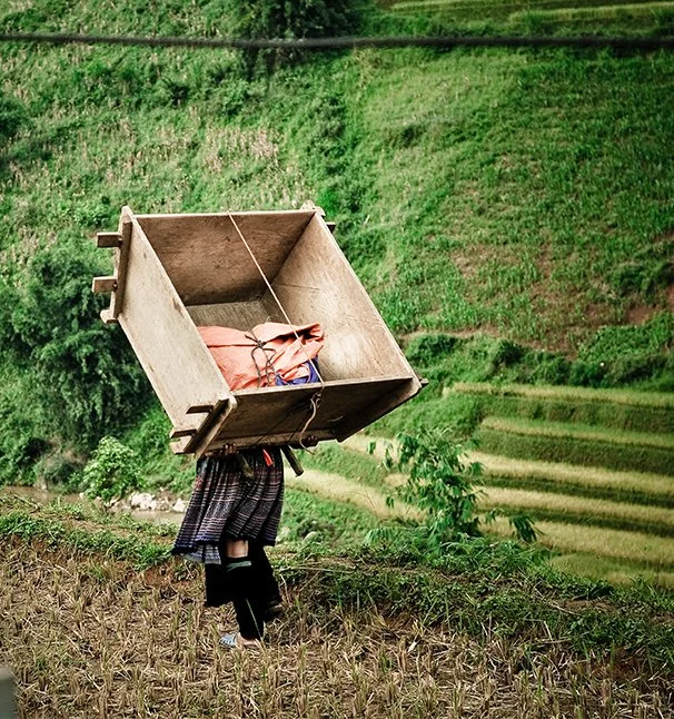

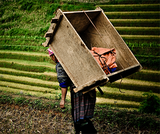
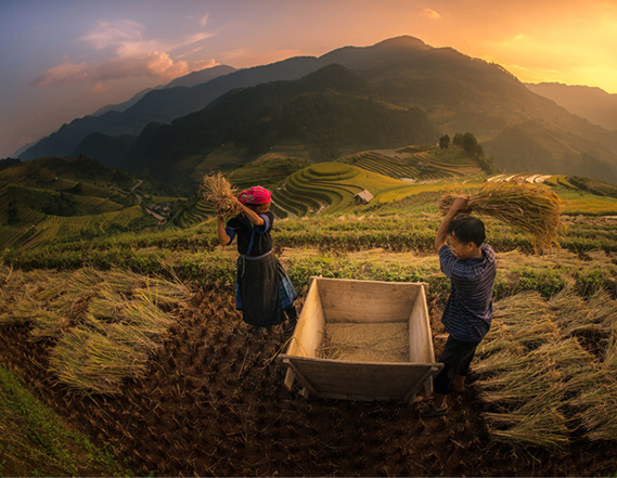
NARRATIVE ATMOSPHERE.


LOGO DESIGN.


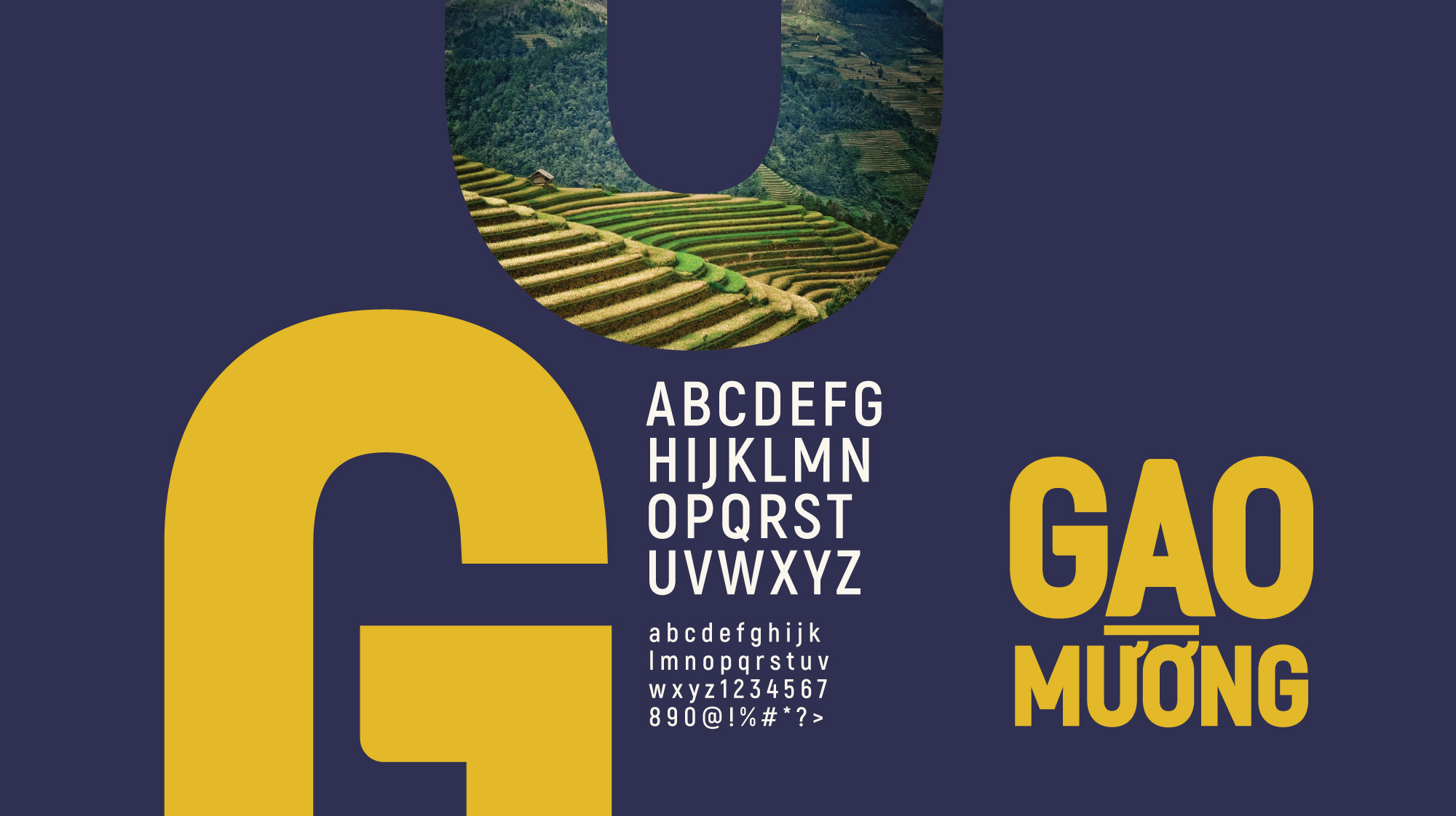


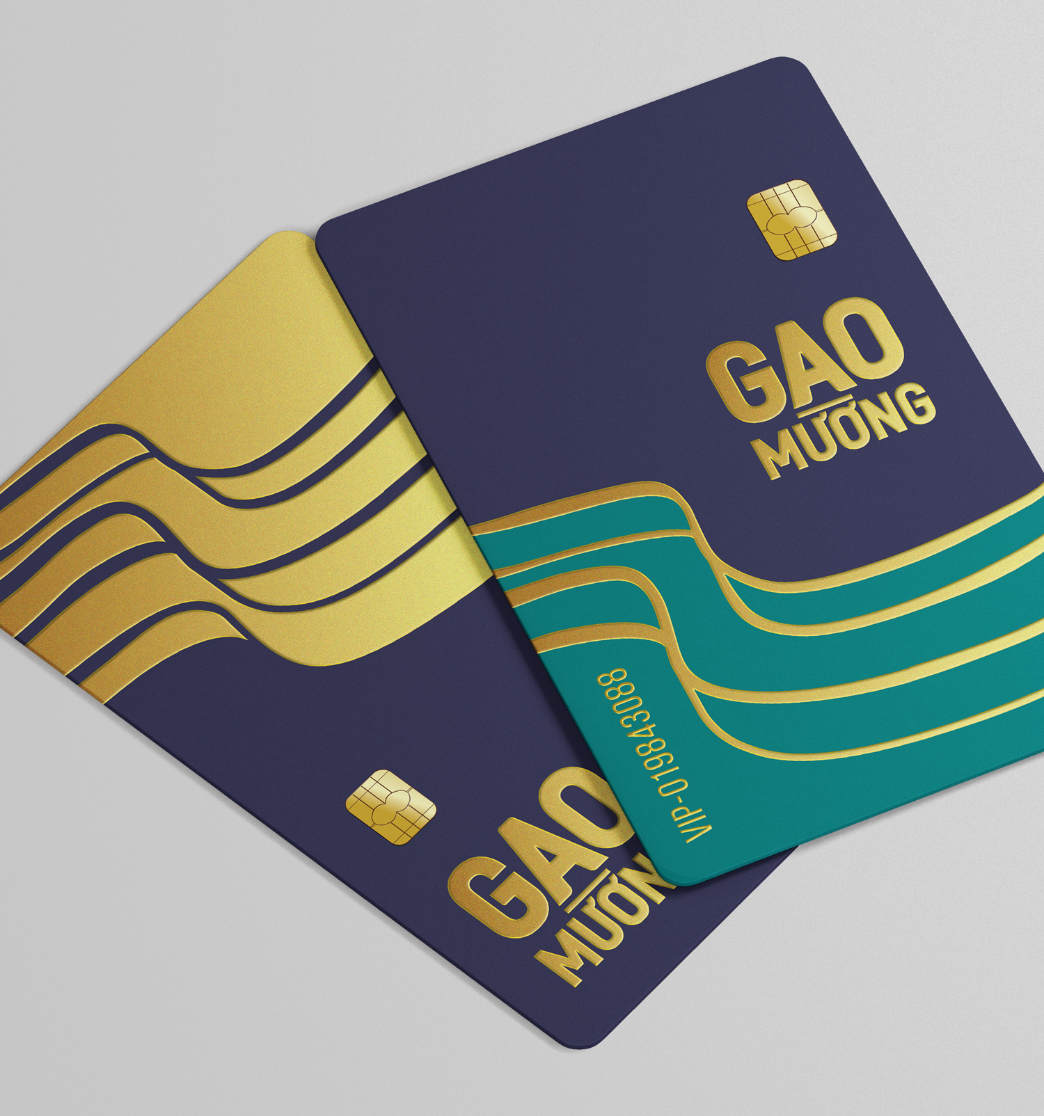

VISUAL SOLUTION.
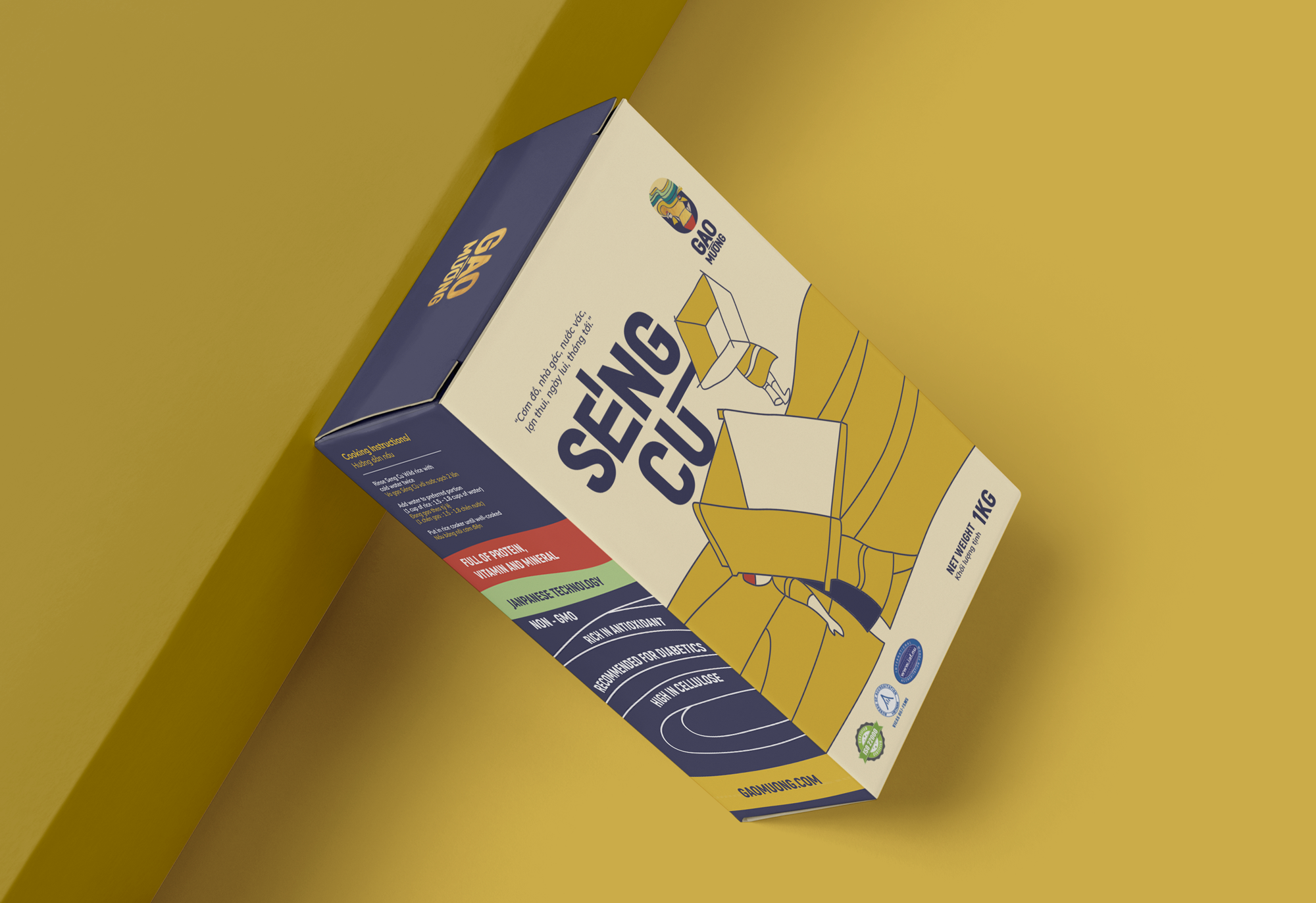
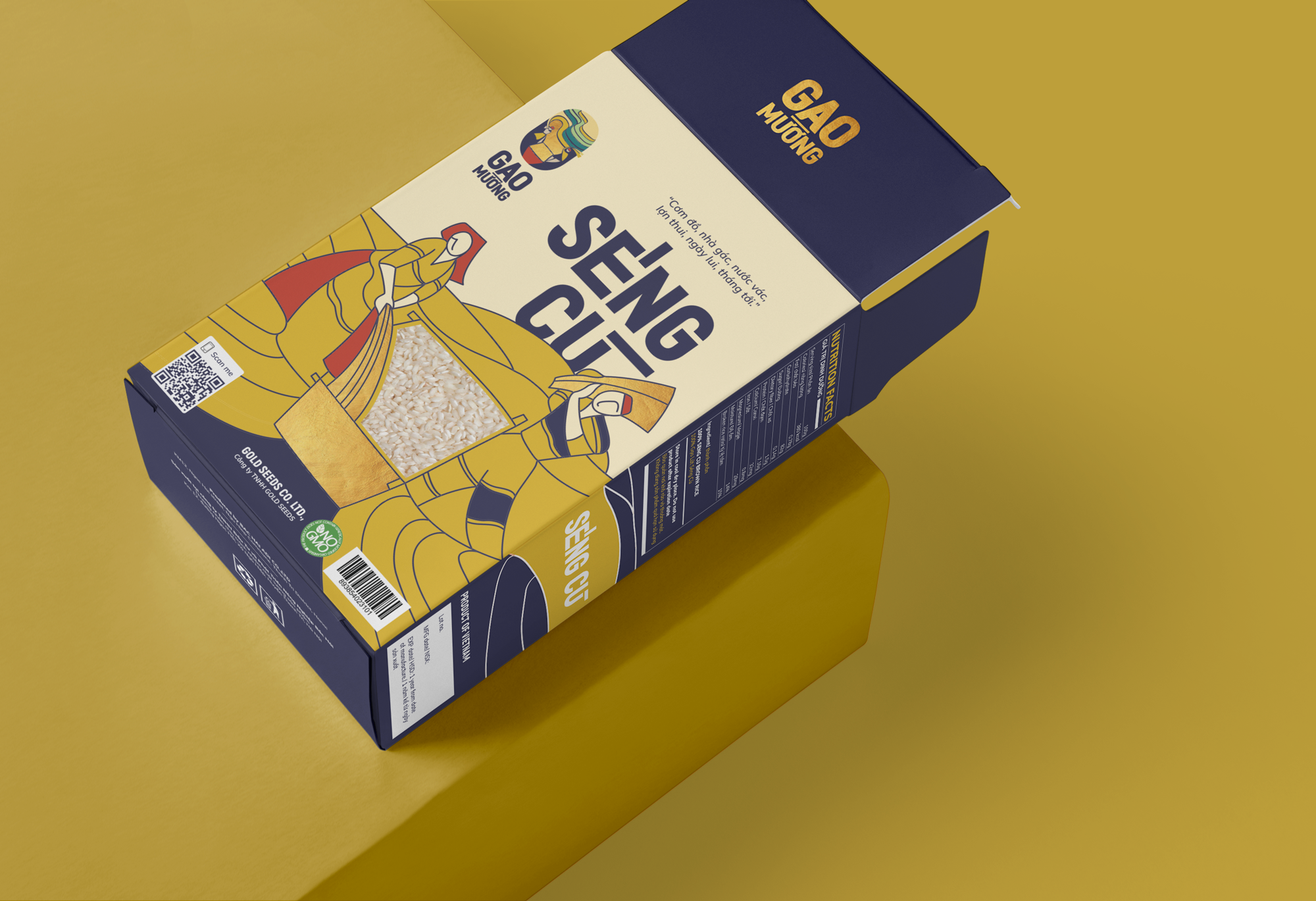
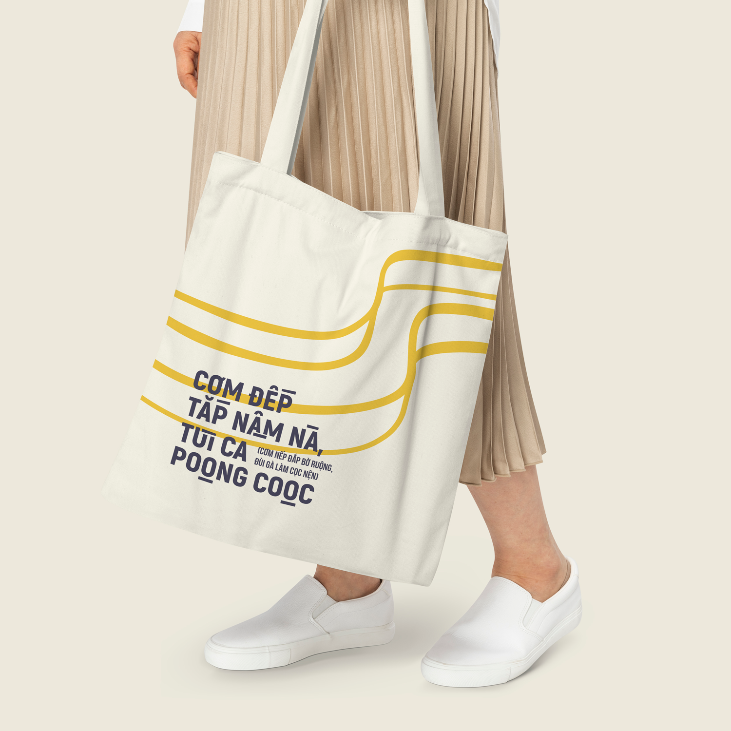
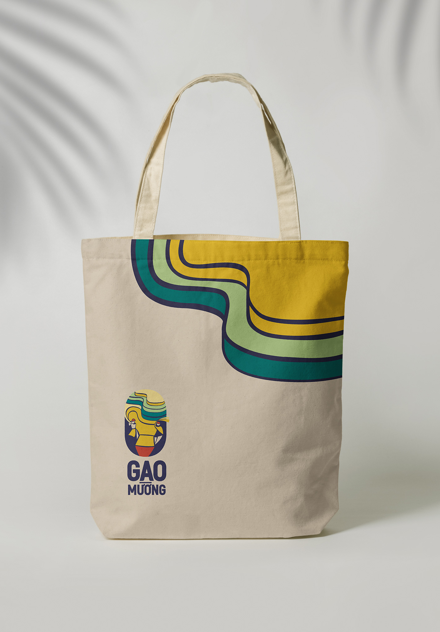
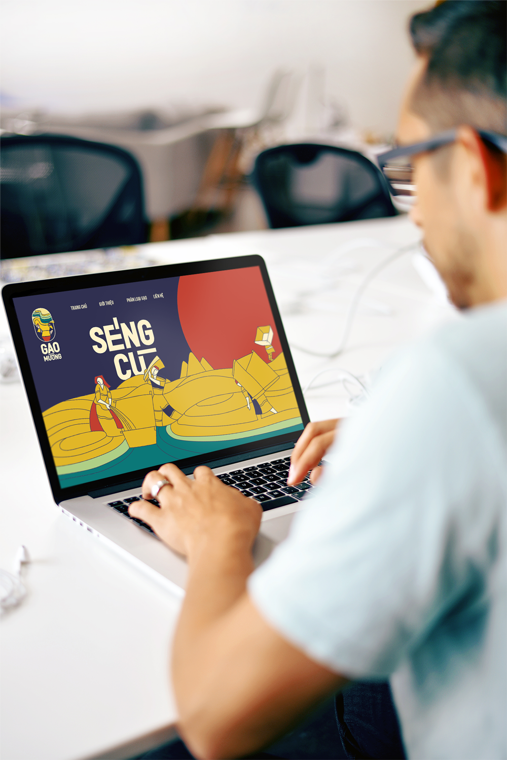
Hoạ tiết trên bao bì sản phẩm được lấy cảm hứng từ câu chuyện mùa gặt và chất liệu văn hóa đặc trưng của địa phương, được sử dụng trên các dạng sản phẩm truyền thông có tính trang trí và minh họa cao, tạo ấn tượng bằng ngôn ngữ hình ảnh, màu sắc như bao bì, túi, hộp, phương tiện vận chuyển, web-banner,…
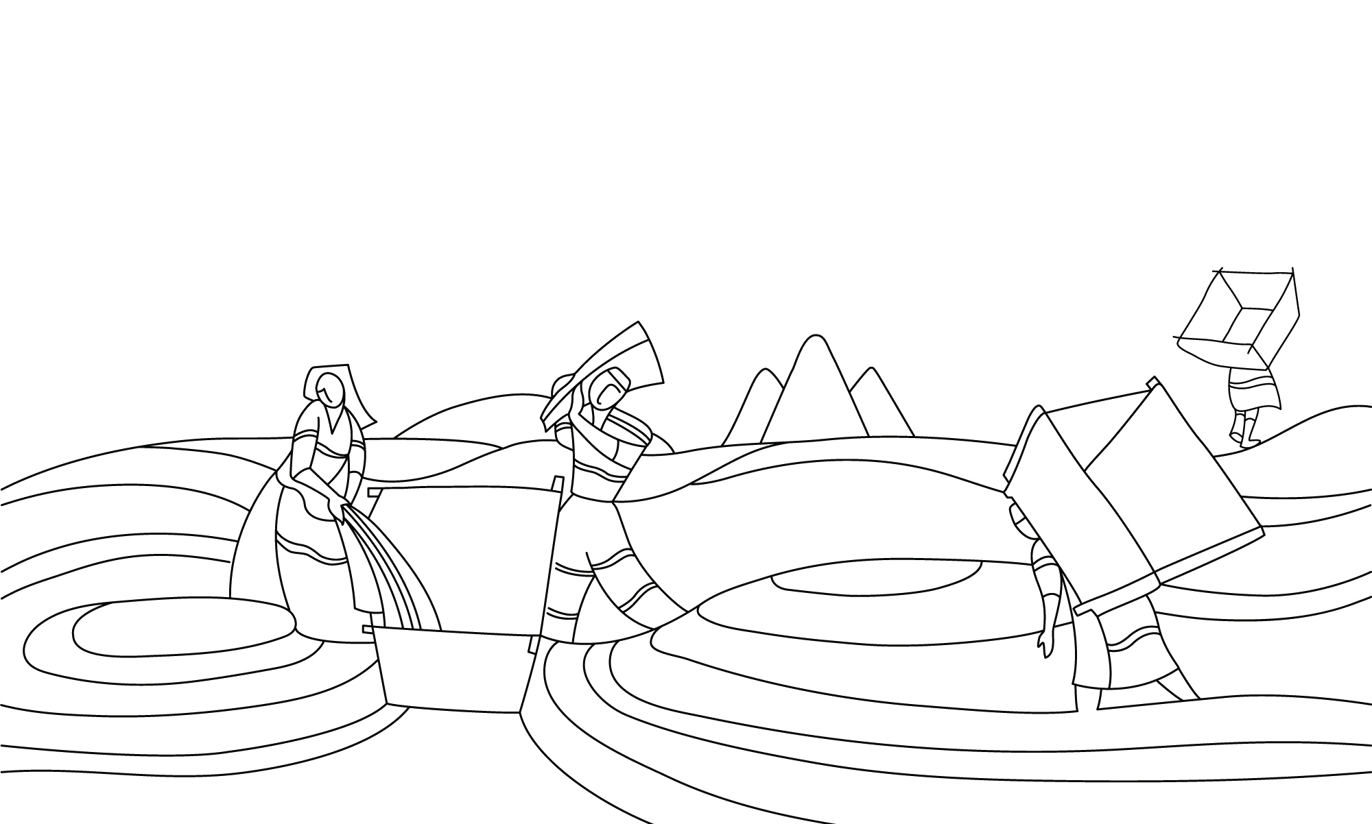
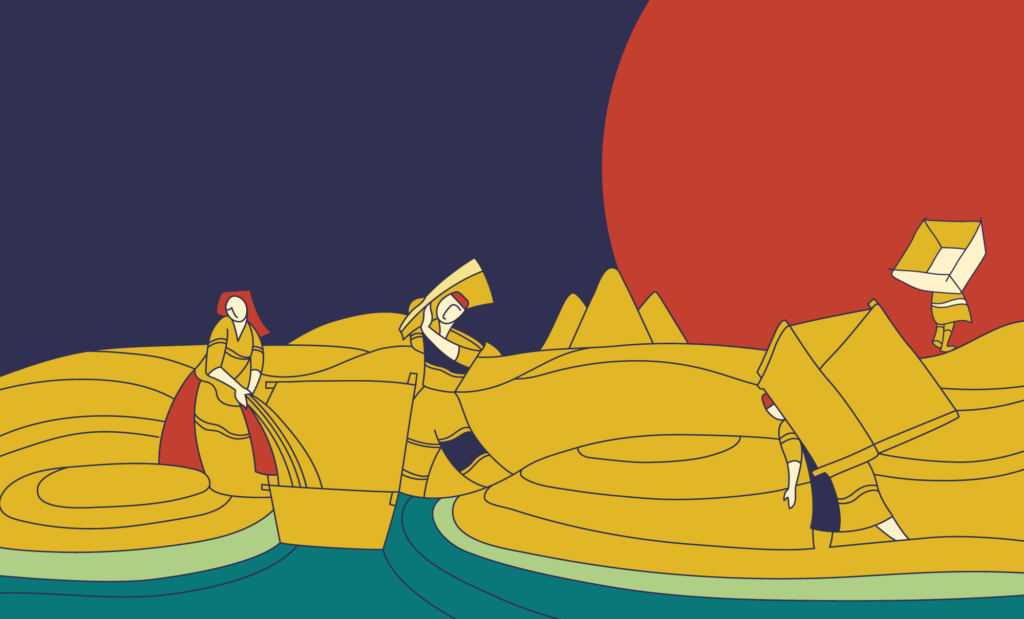
Câu chuyện về Séng Cù là câu chuyện về những hạt “gạo trời” lớn lên trên đỉnh núi. Hạt gạo nào cũng tắm trong ánh mặt trời, vờn trong mây, uống sương sớm miền Tây Bắc, rồi theo lưng các bà, các mẹ mà xuống núi.
GAO MƯỜNG.


Cám ơn Gao Mường đã cho chúng tôi cơ hội được đồng hành!
Scope of product: Organic Food
Client: Gao Mường
Type: Logo | Brand Identity | Packaging
Designed by: Wetouch
Creative Direction: LMC
Art Direction: Thanh Nguyễn
Outline Sketch: Lan Anh
Designer: BlueCy | Thanh Nguyễn | Hà Phương
“We tell stories with every touchpoint”