
Australian blue ocean dream.
Scope of product: Engineering
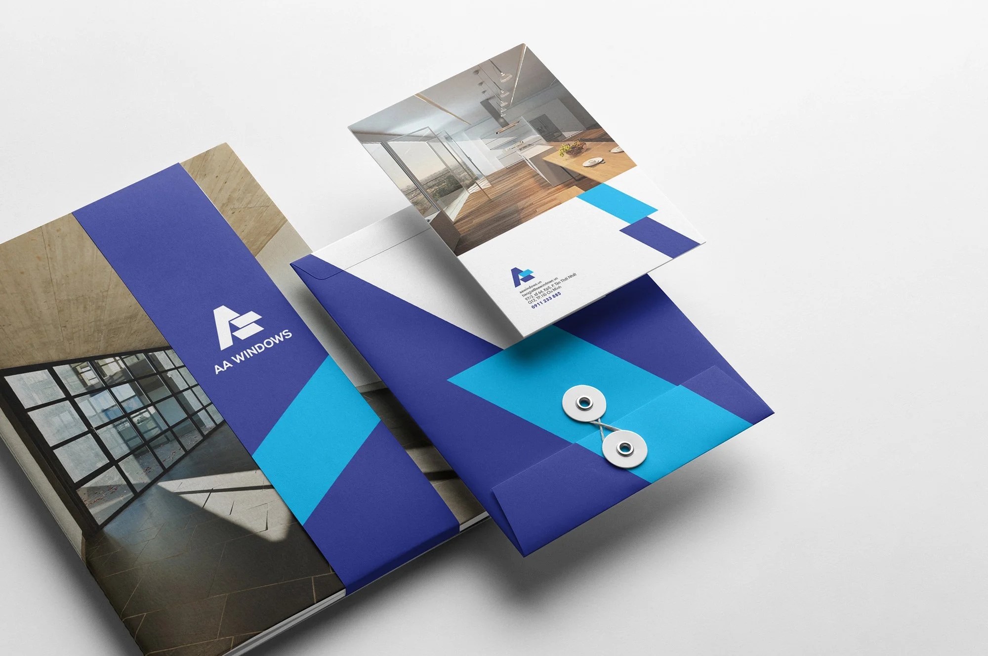
Client: AAWindows
Type: Logo | Brand Identity
Designed by: Wetouch
“We tell stories with every touchpoint”
AAWindows là hành trình mang giấc mơ Úc trở về Việt Nam để dựng xây ngôi nhà Việt mang tiêu chuẩn và chất lượng quốc tế.
STORY.
Khởi nguồn từ một hành trình học tập và nghiên cứu tại Úc, người CEO trẻ của thương hiệu AAWindows đã có những góc nhìn mới về sản phẩm mà mình đang ấp ủ và mong muốn mang những điều tuyệt vời nhất trở về Việt Nam.

BRAND POSITIONING.
Giấc mơ của AAWindows là giấc mơ về những khoảng không gian tự do, thoáng đãng, là giấc mơ về một cuộc sống riêng tư chất lượng và khoẻ mạnh cho người Việt.
SLOGAN.
Cửa nhôm chuẩn Úc dựng xây nhà Việt.

MOODBOARD.

LOGO.
Logo thương hiệu được lấy cảm hứng từ sắc xanh đa dạng, trong trẻo của biển Úc và sản phẩm đầu tiên mà thương hiệu AAWindows sản xuất tại Việt Nam - Cửa sổ lá sách, với những tấm kính chéo góc thể hiện sự cởi mở, đón nhận.


VISUAL SOLUTION.
Đơn giản hoá các tín hiệu đặc trưng và đưa vào thiết kế một cách có kiểm soát, cùng với việc xây dựng bố cục đơn giản, rõ ràng, dễ theo dõi;
Bằng cách đó, chúng tôi đã dung hoà giữa phong cách hiện đại, sự cao cấp của thương hiệu nhưng vẫn giữ được nét gần gũi, quen thuộc trong cách tiếp cận một sản phẩm kỹ thuật, đồng thời tạo ra những điểm nhấn quan trọng gợi nhớ về thương hiệu.


Cám ơn AAWindows đã cho chúng tôi cơ hội được đồng hành!
Scope of product: Engineering
Client: AAWindows
Type: Logo | Brand Identity
Designed by: Wetouch
“We tell stories with every touchpoint”